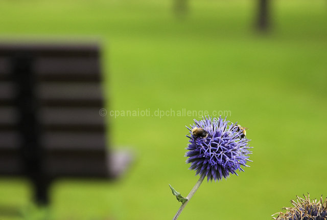
A few compositional tips. I think slanted subjects are more appealing to the eye if they slant "into" the picture rather than "out of". With that we need to move the flower to the left. This will do a few things for us. 1) Less bench. It isn't as appealing as the nice green of the grass. 2) No second flower or bush. The plant in the lower right corner distracts without adding additional effect.
If possible, I would have gotten a bit closer so the flower itself is in the top half of the picture instead of the bottom half. Just seems to balance better that way.
Your colors are nice however and the blue/violet contrasts nicely with the green.
EDIT: haha, I see you figured this out all on your own. :)
If I had wanted another flower/bees picture then that's what I would have presented. That was not the idea. Thanks for the suggestion for a different photo though.
Colours are vibrant and there is a sense of openness yet the bees are going about their activity with out notice of the background.
That being the message I was trying to portray I think the flower and the bees need to be sharper.
The bench is a major element yet detracts the viewer from the main intended content as does the flower in the lower right. The flower could be cropped without losing anything.
As far as making the bench less distracting, possibly trying for a slightly different angle to include less of it and more of the trees in the background. Also, more dof would give more definition to the background and possibly make it less distracting.
nice use of a long lens, comp ok, benc distracting, nice color, good light, excellent texture, minimalistic feel, blacks ok, whites barely in, overall can be done better
I think this could have done with a little more cropping as it is really oblivious. the flower on its own with the green background would have been awesome.
Interesting picture, Love the splines on the flower. I might have cropped it a bit tighter to get rid on the 2 tree trunks and the other flower(?) in the bottom right. I like the bench though, seems to add to the picture well.
However, the extra plant in the lower right is distracting - I would very much suggest cropping that out. Also, I think dropping down for a lower angle and to the left (and zooming in a bit more) would give the main subject a more prominant composure.





 Add photograph to your favorites
 Add photographer to your favorites

 Photographer found comment helpful.


