| Author | Thread |
|
|
01/14/2006 07:47:28 PM |
Greetings from the Critique club :O)
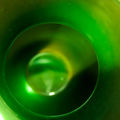
Just te get it out of the way, it's too small. There, I said it.
The colors in this are just great, very bright but with enough dark contrast to keep it interesting.
I can see you used a shallow DOF, with the front being severely OOF, it may be the size but it didn't work. With the picture being so small as entered, it doesn't serve the effect of singling out the piece of candy int the upper third. I'm thinking maybe it's a different shape than the others, but again, I can't completely see that. You're comments say it is, but I can't really tell. The point of using shallow DOF and other comp techniques it to immediately bring the viewer to the subject of the photo. Being so small, the technique loses impact.
Possibly removing the wrapper could also serve to highlight the candy also, though I know you were using shallow DOF to single it out, just another method. Using color contrast and a non-matching patterns also makes a subject pop out. A bright solid Candy of a different color scheme than the wrappers would pop out even at this size.
Hope you found this helpful, and keep working on your entries. |
|
 Photographer found comment helpful. Photographer found comment helpful. |
Comments Made During the Challenge  |
|
|
01/10/2006 01:39:31 PM |
|
See the tutorial under "learn" for sizing your image. You should try to get your hptot as close to 640 pixels on the long side as you can. From experience, I know you will get low marks just for the small size. |
|
|
|
01/09/2006 10:07:00 PM |
|
I like the idea, but I do wish your photo had been larger - closer to the max. 640 pixels allowed by the rules. For me, seeing a larger photo has a greater visual impact (and can't hurt with us voters). :-) |
|
|
|
01/09/2006 05:11:58 PM |
|
be prepared to receive comments that this photo is "too small" |
|
|
|
01/08/2006 08:38:11 PM |
|
"Shape" gets lost in the busy-ness of the subject for me. Decent image. Make it bigger next time ... use all 640 pixels available to you. PM me if you want to discuss size. |
|
| Photographer found comment helpful. |
|
|
01/07/2006 10:59:38 PM |
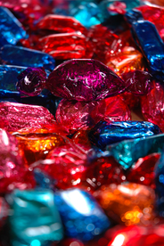
These are great holiday candies!
But the concept of shape is overwhelmed by all the colours and all the textures of the wrappers. Perhaps if you had isolated the one in the purple wrapper against a plain background, the shape of the object would be stronger.
Also, the image is so small that it's hard to see the details... you can post images up to 640 pixels on the larger dimension. |
|
| Photographer found comment helpful. |
|
|
01/07/2006 04:27:09 PM |
|
make sure to use the full 640 pixels in the future. It makes for an easier photo to rate. |
|
|
|
01/07/2006 03:12:32 PM |
|
Average shot. Inspire me. |
|
|
|
01/07/2006 01:40:25 PM |
|
size would be beter larger. love how the frame is filled. |
|
|
|
01/07/2006 11:14:52 AM |
|
Between the small upload size, and the bright-but-mixing-together colors, I found it difficult to see what your shape was, at first. |
|
|
|
01/06/2006 08:14:58 PM |
I know people are knocking you on the size -- it really is a good idea to use the full 640-pixel dimension if you can, just because people tend to score smaller images lower.
As for the content of the image, it looks busy, but I can see a focal point, so that's good. The colors are nice. |
|
| Photographer found comment helpful. |
|
|
01/05/2006 11:49:12 PM |
|
Nice colors. Wishing for more pixels and more DOF / less foreground blur. |
|
|
|
01/05/2006 05:27:29 PM |
|
Too bad this is so small. Could have been a nice photo. 3. |
|
|
|
01/05/2006 12:49:47 PM |
|
no shape is standing out for me... |
|
|
|
01/05/2006 06:37:43 AM |
why is this picture so small???
4 |
|
|
|
01/05/2006 03:34:11 AM |
|
A good concept for the theme, but it would have been good if your submission was larger as it is difficult to ascertain detail from your small image. |
|
| Photographer found comment helpful. |
|
|
01/04/2006 11:36:10 PM |
|
Very good image of textures and colors, which both obfuscates the shape. |
|
|
|
01/04/2006 07:15:39 PM |
|
|
|
01/04/2006 11:36:23 AM |
|
Photo is small and extreme fuzziness in the foreground is a detractor. Nice colors. |
|
|
|
01/04/2006 10:37:39 AM |
|
And one that makes it hard to keep a girlish shape! Very bright and colorful image. |
|
|
|
01/04/2006 09:36:23 AM |
|
This picture needs to be larger. From what I can see, the color and texture are more important than the shape. |
|
|
|
01/04/2006 07:16:56 AM |
|
needs to be bigger. But you do have nice dof and the focus on that one single piece is really good. |
|
| Photographer found comment helpful. |
|
|
01/04/2006 04:05:31 AM |
|
|
|
01/04/2006 02:09:05 AM |
|
Home -
Challenges -
Community -
League -
Photos -
Cameras -
Lenses -
Learn -
Help -
Terms of Use -
Privacy -
Top ^
DPChallenge, and website content and design, Copyright © 2001-2026 Challenging Technologies, LLC.
All digital photo copyrights belong to the photographers and may not be used without permission.
Current Server Time: 06/29/2026 10:39:53 PM EDT.