| Author | Thread |
Comments Made During the Challenge  |
|
|
07/13/2003 10:55:20 AM |
|
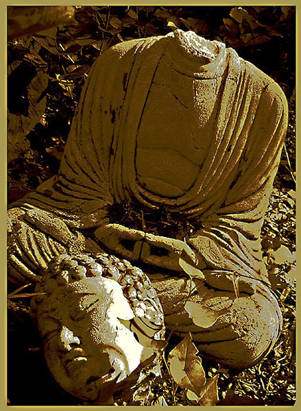
I personally do not care for the artistic effects. I would have liked to see the picture as it is in reality. I think the subject speaks for itself without added photo enhancement. |
|
|
|
07/11/2003 06:25:41 PM |
|
Not keen on the posterized look but it's quite appropriate here. Makes you reflect on vandalsim , etc. [6] |
|
|
|
07/11/2003 12:38:48 PM |
|
I like the idea of this shot, but I don't really care for the coloration. To me, it takes away from the image and it's message. (Clipped the knee a bit, too!) 6 Rob the Swash |
|
|
|
07/10/2003 08:23:29 PM |
|
I cannot tell you how much I loved this photo! I CAN tell you I don't care for the frame, even if you did match the colors perfectly. It distracts from a strong, strong image and it loses the enormous power it should have. Just my opinion, I realise, but... |
|
|
|
07/10/2003 04:56:40 AM |
|
I think this would've been a better entry without messing with the colors so much. I'm sure it would've. The leg is cut off a bit, but the rest of it seems pretty good. Not sure why the colors were altered so drastically. |
|
|
|
07/10/2003 12:02:32 AM |
|
Poor Buddha! A nicely composed photo with the head and shoulders at the thirds. Colors seem overprocessed, which I don't mind very much, except that in this case, it doesn't enhace the photo's feel or mood or communication. |
|
|
|
07/09/2003 03:06:33 PM |
|
If this weren't so harshly postprocessed, I could rate it higher. The flat white areas and speckles on the head in particular are jarring - it makes it look like it was painted, or has a lichen growing there. Still, 7. |
|
|
|
07/08/2003 02:41:46 PM |
|
Nice artlike effect but it has been bumped out of the photograph look. 6 |
|
|
|
07/07/2003 07:37:47 PM |
|
Great elements, but a bit saturated with that otherwise, gorgeous tan-gold color. |
|
|
|
07/07/2003 02:03:47 AM |
|
|
|
07/07/2003 01:05:55 AM |
makes me wonder most out of the photos so far
why is the the statue beheaded
why the border
why the duotoning
I think the original shot without the post processing would have been MUCH better a 4 I think it could have gone as high as an 8 without the processing |
|
Home -
Challenges -
Community -
League -
Photos -
Cameras -
Lenses -
Learn -
Help -
Terms of Use -
Privacy -
Top ^
DPChallenge, and website content and design, Copyright © 2001-2026 Challenging Technologies, LLC.
All digital photo copyrights belong to the photographers and may not be used without permission.
Current Server Time: 06/29/2026 08:55:41 AM EDT.