| Author | Thread |
|
|
01/15/2006 05:21:04 PM |
::: Greetings from Critique Club :::
Hi, as requested, here is an indepth critique of your submission.
First Impression - the most important one:
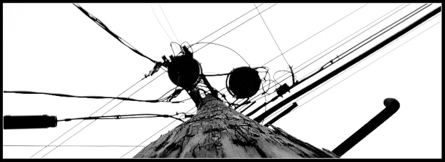
Definitely an interesting take on the Shapes Challenge. Very high contrast and somewhat appealing for being something rather mundane.
Composition:
One again, composition is interesting. It shows you had purpose in the compsotion with the diagonals stretching from corner to corner of the photo.
Subject:
Not clearly defined, but I see that you were showing the messiness of the geometry of the power lines and transformers.
Technical (Colour, focus, and light):
Colour :Good use of high contrast B+W.
Focus is sharp.
Lighting: You actually have good exposure considering the intensities of lighting here.
To grow its vote?:
This is the hardest part of the critique. Perhaps singling out a shape withing the composition would have grown the vote some. DPC's voters are fickle, so it's generally hard to tell what they are wanting with any given challenge. I suspect from your comments, you entered just to enter and are the type to just let the score fall where it may. As long as you have fun shooting, right?
Summary:
You have a knack for the unusual. This isn't a bad thing. You seem to enjoy what you are doing. I say as long as you are having fun, shoot away. Oh, btw, I tend to agree with you that a lot of shots around here are way over-processed.
Hope to see more from you soon,
Leroy |
|
 Photographer found comment helpful. Photographer found comment helpful. |
|
|
01/11/2006 06:19:40 AM |
I gave this a 3. The perspective was unusual, however it didn't enhance or emphasize any 'distinct shapes' in my opinion. Depending on the quality you had to work with, perhaps a much tighter crop (widthways) to try to emphasize the 'main shapes' you had (which to me were the two 'circles') may have helped this. The black frame mainly enhanced the black lines within the shot and therefore did not help with isolating a dominant shape. The toning was 'ok', but again, the sharpest focal point was not on the most distinct 'shape', in my opinion. As for one of your 'questions' in the thread "Was it WAY too messy?" - in my opinion, yes it was fairly 'messy' (WAY, not sure I'd go to that extreme) and, in reading that now and seeing your title (which I didn't pay much attention to during voting, especially in making a connection with 'your intent' with this shot) - seems you were aware it could be a 'messy' shot, but once again, the 'geometrics' just weren't obvious enough.
|
|
| Photographer found comment helpful. |
|
|
01/11/2006 01:43:18 AM |
To me, this is patterns, not shapes. Doesn't seem especially relevant to the challenge. No shape dominates the image.
R. |
|
| Photographer found comment helpful. |
|
|
01/11/2006 12:34:51 AM |
I voted 4, should have left a comment so I will now. The Good: liked the BW, think it works good here. Liked the DOF, seems pretty deep.
The Bad IMO: 1) Pole is centered which seems more static to me. Possibly an offcenter crop with pole angleing through the frame would have complemented the other angles. 2) Just too much going on in the frame so hard for my eye to find a focus and it tends to just move on.
my 2cents.
Keep shooting. |
|
| Photographer found comment helpful. |
Comments Made During the Challenge  |
|
|
01/10/2006 09:08:18 AM |
|
I like how you make the pole look like a triangle. |
|
| Photographer found comment helpful. |
|
|
01/09/2006 06:39:31 PM |
|
Also very interesting - Love the contrast |
|
| Photographer found comment helpful. |
|
|
01/05/2006 03:51:50 PM |
|
Interesting perspective. I like the high-contrast effect. |
|
| Photographer found comment helpful. |
|
|
01/05/2006 02:21:44 PM |
|
Hmm. This is a good effort, and I see what you were trying to get across. I do like the different view -- straight up the pole -- but there's just too much to look at when my eyes get to the top. Good contrast, though, and black & white was a good choice. |
|
| Photographer found comment helpful. |
Home -
Challenges -
Community -
League -
Photos -
Cameras -
Lenses -
Learn -
Help -
Terms of Use -
Privacy -
Top ^
DPChallenge, and website content and design, Copyright © 2001-2026 Challenging Technologies, LLC.
All digital photo copyrights belong to the photographers and may not be used without permission.
Current Server Time: 07/01/2026 09:20:26 PM EDT.