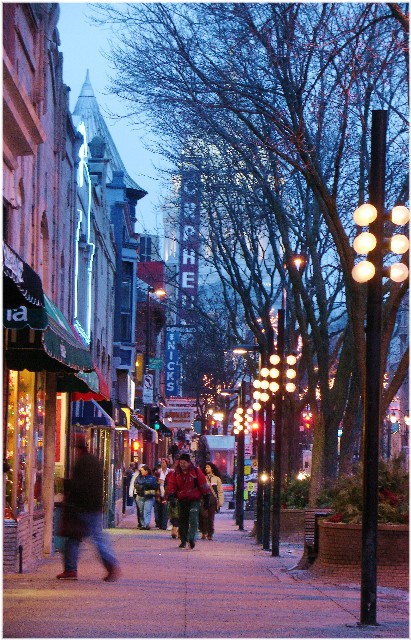
When I see this pop up on the comments page, I can't help but think it's reminiscent of a street scene painting. I like the colors and the activity. I had given it a 7 in the challenge, but failed to comment. If I were to critique anything it might be to straighten the tilt of it a bit, and maybe up the color saturation ever so much.
Nice image of a downtown area! In particular, I like the blurred figure in the foreground--it shows the motion and business of the area. The number of people in the shot also speak to the traffic in this area, which comes off very well for the City Life challenge. The colors in this photo are very good and true to life, for the most part. In the upper left hand portion of the photo, the sky seems to be a bit bright, washing out some of the colors there. Composition of the photo looks pretty good--you've managed to get the movement of the people as well as a small part of the storefronts. I would be curious to see the result if the shot were angle a little more from the right, which would include a bit more of the storefronts and the interesting signs there. I believe also that a slight rotation of the photo might make this more appealing to the eyes of viewers. The sign of the Orpheum, as well as the street lights on the right, lean (ever so slightly) to the right. This can be a hard thing to account for through the camera, as it looks like your horizon is lined up pretty well. Good action and interest in this photo. I feel like I've been to Madison now :-)
I like the colour, although the slight rotation in the image was immediately distracting. Unfortunately, simple things like this can really distract viewers so always watch out for them - a quick rotation in any image software would have corrected this.
This seems out of focus to me? I personally would have liked it better if you had waited a few seconds for the guy in the dark coat in front to move out of the frame.






 Add photograph to your favorites
 Add photographer to your favorites

 Photographer found comment helpful.


