This doesn't really address how you met the challenge or not - I'm just going on the basis of the picture by itself.
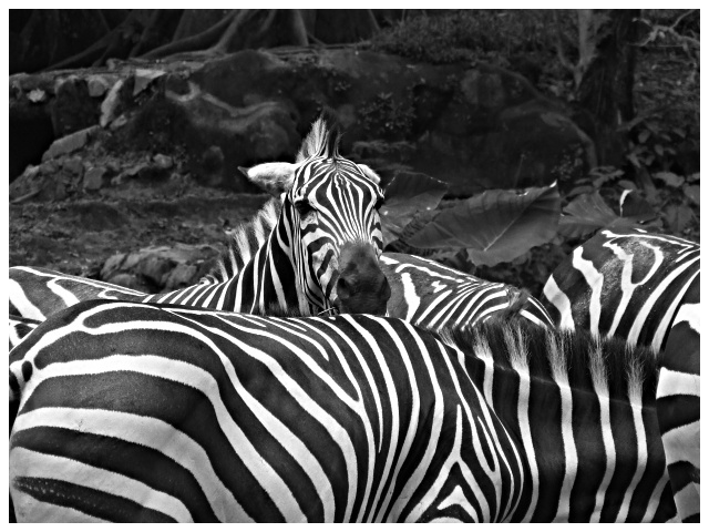
I think I would have prefered to see more than one zebra head - since there are obviously several bodies there, it looks like the single head is kind of sticking up out of place... but I do know that's how zebra shots kind of work. I like the top part, as it gives an environment for the zebras that is natural - it's neat to see no bars or fences in this shot. I agree that the levels or contrast could have been adjusted.
I gave this a 5. Definitely was more of a pattern shot than a shape shot in my opinion. The fact that the Shape Challenge followed the Pattern Challenge - didn't help a lot of people. Maybe, dependent on what you had to work with quality wise, a tighter crop/zoom in on a more distinct shape within the pattern somewhere may have helped this, not sure. As for your b&w v the color, my opinion is (especially after viewing the color), that, given the background in this shot and the amount of it, the color version works better (although the green a bit more vivid to boost the contrast would have helped in that in my opinion). Again though, a variation &/or tighter crop of this, would make the b&w more effective, in my opinion. edit to add:likely a 5 as well if you'd submitted the color version instead
I think this would work better if more were cropped off the top. There seems to be too much empty space. I do like how the one zebra seems to be looking at you while all the others munch away.





 Add photograph to your favorites
 Add photographer to your favorites

 Photographer found comment helpful.


