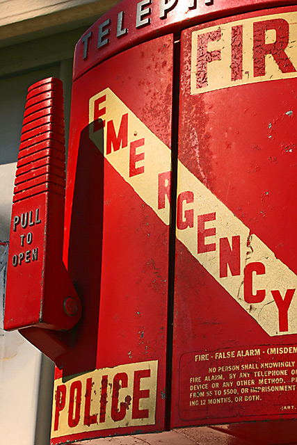
I like the photo. The colors and focus are nice. I think I like the way you have captured it from an angle. I probably would have shot it straight on in order to capture the entire phone box, but I think it has more "character" this way. As I'm looking at it, I noticed that the Emergency seems to be split strangely. (EME RGENCY) Bigger spacing between the 2nd E and the R. It makes me wonder if it was done that way on purpose, or if it just got laid out wrong initially. I think a good photo will draw the viewer into it, making them feel like part of the frame. Your photo has done that to me.
Awesome - I love historic items like this. They always seem to present photographic opportunities. My only criticism would be the harshly lit spot at the top of the box - probably from the sun. You probably had few options to avoid this but ideally a diffusion panel would have softened the lighting (including the shadow from the handle). I love the colour - glad you chose that over black+white.
an interesting portrayal of city life, different than many others i've seen. however its not extremely visually appealing, a picture of a fire alarm is not necessarily something i would put on a wall.






 Add photograph to your favorites
 Add photographer to your favorites


 Photographer found comment helpful.


