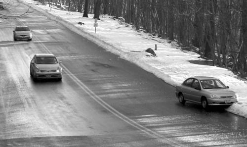
thanks to everyone for the comments. this shot was taken out of a moving car window. the colors were dull so i converted to b/w. it is certainly not my best shot, but the only one i took in that time frame which conveyed the theme of the contest.
I am to critique your photo "wrong way" as requested.
First Impression - the most important one: Interesting picture, a little stark and a bit small.
Composition: The composition is ok. I probably would have worked the broken down car into thirds a little more to make it a bit more of the focus of the picture.
Subject: Great choice of subject matter. Always and so often happens and all you think is sh!!t .. how did they manage that.
Technical (Colour and light): The picture appears a little blurry but this may be the depth of field. Also a number of the commentors have mentioned that they like the black and white aspect, but how does it look in colour. I would also work on the resizing options as 640 longest side is going to get a bit more attention (especially in thumbnail) than something smaller.
To grow its vote?: Solid entry... top 50%. As you practice more with your camera and software you will find more ways to entice people into your picture, and ensuring they have to give it more thought.
Summary: Well done, keep it up.
If you've got any questions about this critique, please feel free to contact me via the PM system.
One of the few entries where it conveys "oops." - point for that. The grayscale looks a bit flat to me. I wonder how this would look with the curves slightly adjusted or more contrast?






 Add photograph to your favorites
 Add photographer to your favorites


