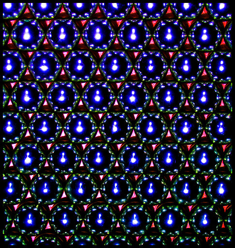
Okay, my first impression of this shot was that it fit the challenge well, some of the spots were blown out a bit, and it was a tad crooked. Upon further inspection and after reading your comments about how you edited this picture in photoshop, i have concluded the following.
It seems like although you took a shot that fit the challenge very nicely, there is nothing in this photograph that really grabs my attention, a focal point. This is an important aspect of any photograph, without a main point why take the photo. I'm also wondering if you experimented with different white balances and exposures. I say this because unless the light source was above the pattern the blown out patches of blue seem a bit over exposed. Maybe a little less contrast in photoshop could cure this.
I hope that I helped and if you have any questions PM me,
Would be better if the pattern was symetrical in the view especially as it is a symetrical pattern in itself but that is probably just me who likes things neat and tidy





 Add photograph to your favorites
 Add photographer to your favorites

 Photographer found comment helpful.


