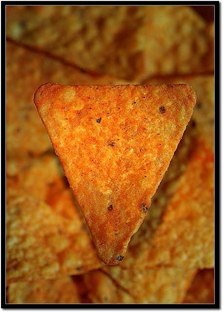
Greetings from the Critique Club. After reviewing your photo I think you have met the challenge pretty well. Technically you have a small DOF that makes your main subject stand out and ask for the attention of the viewer. It has good focus and I like the border, it seems to add to the photo.
A couple of points I think could be improved, centering the subject doesnt seem to work well here, you could have moved the object to the corner of the photo and had the object come out of the corner, might play with different crops to see it. Also the angle on the light adds a bit of a distracting shadow behind the object, perhaps an light angle that moves the shadow to below it might have worked better. And the back ground being the same color as the foreground kind of blends it all together, maybe some different colors in the background to help your object jump out a little more. Overall good job and good luck with future challenges. |






 Add photograph to your favorites
 Add photographer to your favorites

 Photographer found comment helpful.


