| Author | Thread |
Comments Made During the Challenge  |
|
|
07/08/2003 03:53:28 PM |
|
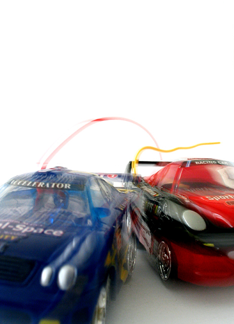
Too much empty background at the top. Nice sense of speed though 7pts |
|
|
|
07/05/2003 05:05:56 PM |
|
this is a cool idea... turned out well... definetly shows speed... the white background really enhances the picture |
|
|
|
07/03/2003 03:46:43 PM |
|
I like the way that you made the back of the blue car transparent so you can see the red one. Nice. |
|
|
|
07/02/2003 10:13:25 PM |
|
This picture looks like it is touched up.... the effects is not natural |
|
|
|
07/02/2003 08:52:58 PM |
|
too much white space on the top |
|
|
|
07/02/2003 08:48:28 PM |
|
are these toy cars? the white background is distracting. |
|
|
|
07/02/2003 03:16:06 PM |
|
a little too much white on top. |
|
|
|
07/02/2003 08:30:07 AM |
|
love the composition, colours and use of neg space.. top marks from me! |
|
|
|
07/02/2003 05:08:06 AM |
|
nice comp. the poor focus doesn't quite feel like speed though |
|
Home -
Challenges -
Community -
League -
Photos -
Cameras -
Lenses -
Learn -
Help -
Terms of Use -
Privacy -
Top ^
DPChallenge, and website content and design, Copyright © 2001-2026 Challenging Technologies, LLC.
All digital photo copyrights belong to the photographers and may not be used without permission.
Current Server Time: 06/28/2026 06:03:39 PM EDT.