| Author | Thread |
Comments Made During the Challenge  |
|
|
12/18/2005 09:20:47 AM |
|
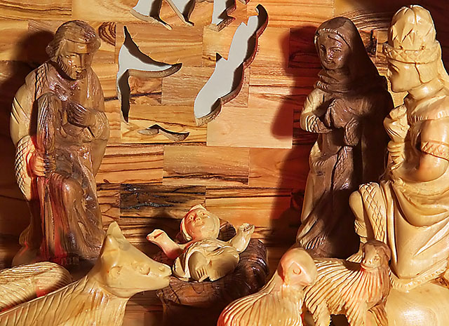
Awesome hand carvings almost too much glare from the lights but I like it |
|
 Photographer found comment helpful. Photographer found comment helpful. |
|
|
12/15/2005 12:01:50 PM |
|
| Photographer found comment helpful. |
|
|
12/14/2005 11:11:52 PM |
|
Very nice! The lighting is a bit harsh but I love the full frame of your subject. |
|
| Photographer found comment helpful. |
|
|
12/14/2005 07:52:00 PM |
|
Pretty, some greenery would have helped this. |
|
| Photographer found comment helpful. |
|
|
12/14/2005 07:21:26 PM |
|
If possible, I'd bounce the flash here or use a slow shutter speed on a tripod to eliminate the shadows. A different crop might work well too, maybe showing more of the manger scene. |
|
| Photographer found comment helpful. |
|
|
12/14/2005 04:27:33 PM |
|
the lighting is off and casting harsh shadows in some places and washing out others |
|
| Photographer found comment helpful. |
|
|
12/13/2005 04:48:33 PM |
|
This is a nice subject and you got in nice and close. The lighting leaves something to be desired----the shadows behind the figures are harsh and distracting. Also, the grey background behind the cut-out angel just looks plain bad. It is very drab and there are the shadows that really stand out. Using a black background and positioning the creche further away from it would have provided a sense of space surrounding the creche. As it is it looks quite a bit cramped. |
|
| Photographer found comment helpful. |
|
|
12/13/2005 11:50:19 AM |
|
Nice composition but the lighting is a bit harsh for my taste, too many glaring headlights and strong shadows and it just doesn´t seem fitting for this shot to me. |
|
| Photographer found comment helpful. |
|
|
12/12/2005 07:04:38 PM |
|
Shadow behind Mary is a bit harsh. Good wood/color quality |
|
| Photographer found comment helpful. |
|
|
12/12/2005 02:39:20 AM |
|
I would have liked this better if the lighting weren't so harsh. |
|
| Photographer found comment helpful. |
Home -
Challenges -
Community -
League -
Photos -
Cameras -
Lenses -
Learn -
Help -
Terms of Use -
Privacy -
Top ^
DPChallenge, and website content and design, Copyright © 2001-2026 Challenging Technologies, LLC.
All digital photo copyrights belong to the photographers and may not be used without permission.
Current Server Time: 06/29/2026 05:52:53 PM EDT.