|
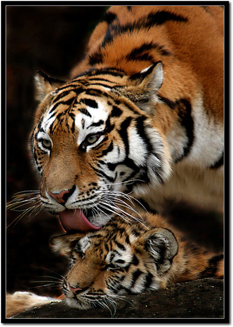
As I said in the triptych, great captures. In my opinion however, the coloring was better in the triptych version - this seems overall a little dark, especially compared to the other, which of course is difficult to discern at this/that size. Perhaps you were trying to attain this added darkness (your call obviously), just my opinion the coloring worked better as you had it in the triptych. '1' in the triptych was also a very good shot and good depiction of 'devotion'. This also seems to have a few 'issues' (a red 'tint', or something), on the left of the tongue and the left of the cub's 'chin'. |




 Add photograph to your favorites
 Add photographer to your favorites

 Photographer found comment helpful.


