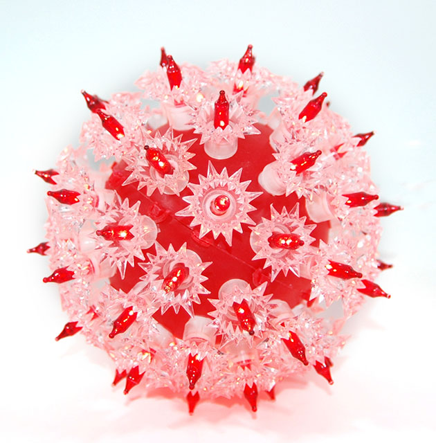
Nice capture. I like the duotone inherent here. A square composition would suit this well (need to crop off a little on the top imho). Good focus and exposure
I REALLY love the red/white contrast here. It makes it standout so well, and I absolutely love the shadow at the bottom of the ornament. The image seems to blur a little near the top but the focus on the middle is fantastic!
LOVE IT!
Interesting ornament. Seems a bit overexposed. I'm guessing you've alrready received numerous comments about the spelling in your title so I won't mention that. ;)
Cool idea. It is a little over exposed in my opinion. I think there would be a little more impact if it were slightly darker and the "lights" got to shine a little more.
Ah! This makes my eyes go crazy when I look at it...kind of like when you look at a chain linked fence...ANYWHO- this is definatly catalogue material, nice job!






 Add photograph to your favorites
 Add photographer to your favorites


 Photographer found comment helpful.

