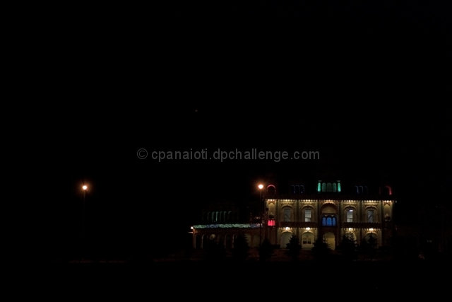
I gave this a 7 when I voted. I like it, but I would say there is too much negative space. If you were able to crop tighter so that the temple took up say half the picture vertically and 2/3rds horizontally, I think it would be stronger. We would be able to see more detail in the building and I was intrigued by the colors which you could see. It mad me curious as to what was going on there. The lone lamplight may be a distractor and were it advanced, I'd be tempted to clone it out.
The subject takes up a brilliant portion of the picture. It is a truelly creative composition when the eyes is drawn to such an interesting building as this one. 9
i lke this photo.... but! the black is too much if you filled your frame up to your subject you would be just fine.... because its a little distracting but apart from that your overall creativity of art is just fine
good job
good grade







 Add photograph to your favorites
 Add photographer to your favorites

 Photographer found comment helpful.


