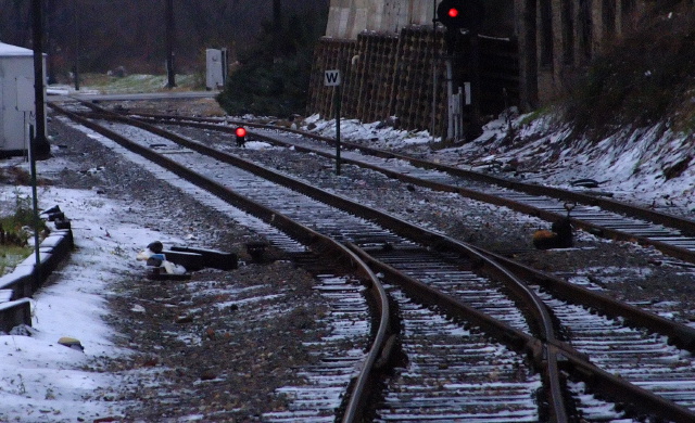
Starting with the positive, I like that you thought outside the box and went for a fork in the tracks instead of the silverware type fork. I also like the strong contrast of your image.
The thing that I find most bothersome here is the lack of a strong focus point. My eye is not drawn to the fork in the tracks. I have to search for the meaning here. If the meaning were cold and void, then you would have me. I agree with other commenters that a tighter crop to the tracks, thus less clutter, would be beneficial here.
I hope you find this critique helpful.
I take it that you're illustrating "fork" as in "fork in the road" - it took me a minute to get the link to the challenge. I think that a single fork in the road would have been more illustrative than what looks like part of a switchyard, or what is in any case a more complex arrangement than a branch from one to two lines. overcomplexity is obfuscating your concept.
well it's a fork, and it's a railroad, and I like the alternative to silverware. But this particular section of track does little for me...sorry. Background too cluttered. I would have cropped just the fork area. Or approached with a lower-angle of attack







 Add photograph to your favorites
 Add photographer to your favorites


