Neil Young lyric.
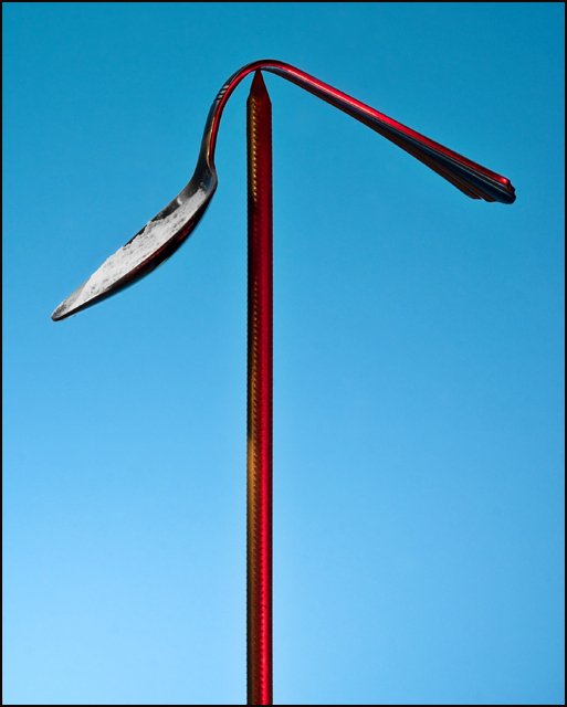
graphical interpretation of said.
i lit the subject with a 25w red bulb placed under the camera. used remote release - fired the 550ex manually part way through exposure to light the background - while painting the 'heroin' with light. was a tricky situation with only a 1.6sec exposure and a very high fstop
the 'needle' is a giant nail i found in the garage, stuck up through a hole i had made in a board for another shot. the spoon was bent, by hand mind you ;} then filled with flour, and balanced on the tip of the nail. i carefully rotated the contraption and took shots along the way.
shot in RAW - mildly edited in RSP - masked the 'heroin' and removed color from whites - cloned out a number of wall blemishes caused by the small aperture and close proximity to the wall - ran velvia filter behind mask - canvas size for border - resize - slight USM - save as for web.
hope you enjoy !
Statistics
Place: 75 out of 163 Avg (all users): 5.4513 Avg (commenters): 6.7500 Avg (participants): 5.2000 Avg (non-participants): 5.6667 Views since voting: 1208 Views during voting: 316 Votes: 195 Comments: 6 Favorites: 0
Hey, I didn't vote in this challenge so I'm coming to leave you a message now. By the way, it also irritates me when a picture of mine does worse than I expected and no one leaves me comments. COMMENTS, PEOPLE.
I had never heard the lyrics quoted in the title before today and when I saw the shot my first impression was that the white was a mistake and that the "damage done" referred to the bending of the spoon. In other words, I bet a lot of people didn't even get the reference. It wasn't until I read in your description that it was a song lyric that I realized the white represented heroin (and, of course, we don't get the description when voting).
Even if I had understood the reference, while I like the symbolism of the white powder, I feel that it detracts from the beauty of the image. For me it ruins the pretty contrast of the red against the blue. Without the white the picture is composed only of two bright primary colors (blue/red). The white muddles that starkness, imo.
If I had voted on the contest and had not understood the reference of your title, I would have given you a 5. If I had understood I would have given you a 7.
I thought it was one of the best in the challenge. It made me stop and think about the message. When I saw the stuff in the spoon, it made me realize what it's about. I thought you did a really good job with this image.
I haven't actually seen anyone else express it like you have done and that's one of the reasons why I like it so much. It's refreshing and it's great.





 Add photograph to your favorites
 Add photographer to your favorites

 Photographer found comment helpful.


