| Author | Thread |
Comments Made During the Challenge  |
|
|
12/07/2005 04:38:41 PM |
|
the editing doesn't appeal to me, it is overdone for my taste. The positive in this is that you are doing something different and creative, but I think that most people will agree that this photo is not working. If you experiment more like this, then maybe you'll find something unique in the end that will create some kind of style for you that will be recognised. |
|
|
|
12/04/2005 09:19:46 PM |
|
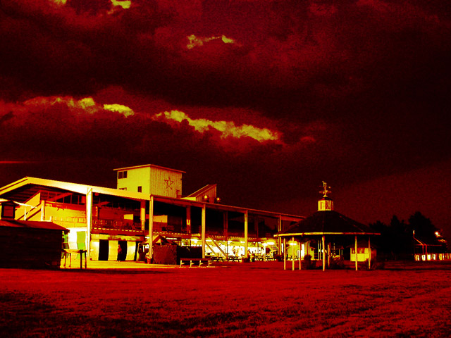
Hmmm, I was going to say that the image is too oversaturated on the yellows and reds but I think that is wholly intentionally to the concept and mood you want to convey. Given the title this scene is supposed to appear dark, sinster, and threatening. The yellows and reds invoke imagery of the flames of hell. The grainyness seen in the clouds also adds to the atmosphere in that it brings a gritty feel to this sinister looking image. |
|
|
|
12/03/2005 10:15:06 AM |
|
This is a bit over done in PP for my taste. I commend your exploration of different looks though. You have guts. |
|
|
|
12/02/2005 11:03:06 AM |
|
I think I know what you're getting at but it looks over-processes all the same. Would actually like to see the original and what you intended. |
|
|
|
12/01/2005 11:59:41 PM |
|
i don't really like the grain or the coloring on this but good luck! |
|
|
|
12/01/2005 03:12:27 AM |
|
it's hard because I really see whatyou were going for but the sinister clouds lack the detail I really want, but see there- too pixelated in the sky. possibly a selective blur might have helped? 7 for your vision |
|
 Photographer found comment helpful. Photographer found comment helpful. |
Home -
Challenges -
Community -
League -
Photos -
Cameras -
Lenses -
Learn -
Help -
Terms of Use -
Privacy -
Top ^
DPChallenge, and website content and design, Copyright © 2001-2026 Challenging Technologies, LLC.
All digital photo copyrights belong to the photographers and may not be used without permission.
Current Server Time: 06/30/2026 02:33:14 AM EDT.