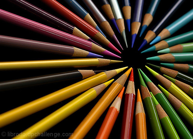
i am always fascinated by colors. that's why my pictures are always colorful. so here's my collection. nothing special but when put altogether, they create something very interesting.
shot with my brother's D100 and with the use of my 16 mm f2.8 macro lens.
Statistics
Place: 1 out of 210 Avg (all users): 7.0584 Avg (commenters): 7.7368 Avg (participants): 7.0870 Avg (non-participants): 7.0452 Views since voting: 16249 Views during voting: 461 Votes: 291 Comments: 86 Favorites: 40 (view)
PS: STOP OPPRESSING THE USE OF HARSH LANGUAGE. HARSH LANGUAGE IS AN INEVITABILITY THAT EVERYONE SHOULD LEARN TO DEAL WITH, AND IS SIMULTANEOUSLY AN EXPRESSIVE FORM OF THE ENGLISH LANGUAGE. WHERE WOULD HEMMINGWAY BE IF HE WEREN'T AN OFFENSIVE SUNNUVABICTH? STICKS AND STONES...
Hemingway was a master of language, he could do in 6 words what many writers could not express in entire volumes. The use of offensive or harsh language in his writing is a reflection of the times and the people that he was writing about, it was not an effort to shock or offend. There are times and places for harsh language, it is not an inevitability that must be accepted. Society has always set up guidelines with respect to behaviors and practices.
My photo comments: (I apologize for the above, but felt the need to respond). Beautiful shot. I personally do like the DOF, I think it keeps it from appearing like a 'pin wheel'. I think the 'Is this a Collection?' argument is pointless. Most challenges are open to a level of personal flexibility on the part of the photographer and it is up to the voters to make their own interpretation of the challenge description. There have been many challenges lately where quality photos were entered, but came in very low due to not meeting the challenge- as interpreted by a majority of voters. The first decision on meeting the 'spirit of the challenge' is made by the entering photographer, the final decision is made by the voters and in this case the voters have spoken. Once again, very well done.
FOR petdog4020:
- from the challenge description -
Details: Stamps, coins, dolls, cars, shoes... people will collect just about anything. Let's see what makes your particular collection special.
For others:
I thought the "kid" comment was foolish. To assume that only people under the age of say... 25 are capable of making "immature" comments or having poorly rated images, is to be a fool. Furthermore, it is a fool who condescends, especially those younger than him/herself. The 18 year old mind and the 40 year old mind are equally capable of and likely to be immature, if in different ways.
I happen to have lived in a house with a colored pencil "collection" anyhow, and it looks nothing like the neat, orderly image I see above. Where, I ask, are the broken pencils? The extremely short ones? Why are they all sharpened? The image above resembles that of a Crayola advertisement.
My previous post was an angry attempt to challenge the voters to think about the images they are voting for. Much of the photography I see winning ribbons is not creative photography, but neat, crisp, overtly dull, sleek sleazy commercial photography.
In my opinion, photography is a form of art. Art is a medium that in order to remain art, should be dynamic and constantly changing. I see little progression on this site, and it is frustrating. Many of the shots that win are not rewarded for creativity but for sleekness. Perhaps my photographic and artistic eye is not agreeably developed, but I am fairly certain that I have seen a number of water droplet shots winning prizes consistently. Water droplet shots? Taking no particular form, with no interesting title, such images I dub "blank images."
I do not claim to be much better than any of this... I repeatedly enter images that are less than impressive to my own eye, and are confirmed as such by voters. However, I think it's interesting that with the image I entered specifically because I knew it was bland and stereotypical, I received my highest score.
so... boo hiss.
PS: STOP OPPRESSING THE USE OF HARSH LANGUAGE. HARSH LANGUAGE IS AN INEVITABILITY THAT EVERYONE SHOULD LEARN TO DEAL WITH, AND IS SIMULTANEOUSLY AN EXPRESSIVE FORM OF THE ENGLISH LANGUAGE. WHERE WOULD HEMMINGWAY BE IF HE WEREN'T AN OFFENSIVE SUNNUVABICTH? STICKS AND STONES...
I AM AWARE OF THE IDEALISTIC NATURE OF THE ABOVE TEXT, AND ENJOY IT AS SUCH. I AM NOT, HOWEVER, AN IDEALISTIC PERSON.
again?! :) but then not again as this takes you away from your usual colorful subjects. but the point still well made. a simple tilt, a simple pattern and voila! again you make us pinoy proud.
I have studied your image and have the following to offer:
Composition/perspective – very interesting perspective in this image. The angle of the camera to the subject sets up a very nice illusion. You are drawn to where the pencils are pointing, but once focused there it appears as though everything is radiating outward. Excellent placement via rule of thirds the focal point. Alignment and placement appears nearly flawless which really adds strength to the scene. Nothing distracting at all. Focus is very good and the DoF used really makes it work near to far across the image. Not much to say other than very well done! A simplistic idea executed very nicely and translated to a very appealing image.
Color – across the spectrum here obviously, but each seems to have retained the original hue. Saturation is good as no color appears flat at all. Against the black background is the perfect choice and really allows each shade to stand on its own.
Lighting – very well done! Everything is well lit and defined while at the same time no distracting glares or reflections off the shiny surfaces.
Challenge requirements – very creative way to meet the challenge requirements.
Overall/my opinion – very well done image! Extremely hard to critique as I find it pleasing to look at; simple yet manages to grab you right away. Very well done!
Wow. I didn't get a chance to vote on any from this challenge, but this one surely would have pulled a 10. It's desktop wallpaper right now! Great job, very creative.
col·lec·tion ( P ) Pronunciation Key (k-lkshn)
n.
The act or process of collecting.
A group of objects or works to be seen, studied, or kept together.
A line of products produced for one season, as those developed by a designer: promoted the summer collection in the store window.
An accumulation; a deposit: a collection of dust on the piano.
A collecting of money, as in church.
The sum so collected.
texttext
Like Philos32 I never would have guessed this to be yours. Technically proficient as always, tho i'm not 100% convinced the shallow DOF adds to it (not that it detracts either).
As for the petulent comment below about it not being a collection...well let's just be glad that we don't all live in his oppressed little box. Nice interpretation, nice shot, nice win.
But you don't COLLECT colored pencils.... you just buy a set of them. Maybe if it were several different types of colored pencils, that would make sense... but no, this is just ONE SET of colored pencils.
THIS IS NOT A COLLECTION, IT IS A SINGLE SET OF COLORED PENCILS THAT ALL COME FROM THE SAME BOX
Two days ago, my wife and I were discussing the ribbon standings, and I pointed out that I might have an advantage because none of the current challenges were suited to portraiture. So not only did you prove me completely wrong, you did it with a well-deserved blue and a 7+ score. ROFL!
Now if you'll excuse me, I have to go torture some kittens or something. ;-)
Shannon, I was just lucky. I don't have your creativity and imagination. Mine is just a copy from a box cover. But yours are always original. And you have the record of not leaving the dpchallenge's homepage for how many weeks now? Anyway...I think we inspire each other.
Two days ago, my wife and I were discussing the ribbon standings, and I pointed out that I might have an advantage because none of the current challenges were suited to portraiture. So not only did you prove me completely wrong, you did it with a well-deserved blue and a 7+ score. ROFL!
Now if you'll excuse me, I have to go torture some kittens or something. ;-)
LOL....for those who commented about a woman standing somewhere, you're right. I took a lot of shots along with this shot and this is one of them.
Anyway...Sally helped me set up this shot.During lunchbreak in school, I requested a friend to sharpen the pencils, I laid them down on the floor (with a black velvet cloth as a base), then asked Warren (and later on Sally) to arrange them in the same manner as shown in the box of the Prismacolors pencil. Not an original idea. But I really went down on the floor to take the shot. Unlike the box picture which was taken from the top, I experimented on the DOF and the angle. An dthe rest is history.
Even though there are a lot of colors it still looks harmonious. Great composition I must say and the way you focoused it was very apropriate. Love the detail!
Oh this is too clever, I went by this picture a few times and didn't quite understand understand the title, then on the thumbnail I noticed the "eye." bumping up!
6 - Very nice colors and composition and angle/perspective. Criticism; difficult, as this is a bit of a stretch for 'collections' in the spirit of the Challenge (and has restricted my score). Near perfect symmetry as far as I can discern, maybe a couple are 'off', but fairly minor. This shot may lend itself well to an abstract too if the focus were adjusted, but moot point.
the black backround really captures the colors and makes this photo really stand out. I really like how the pencils give leading lines to the middle. beautiful shot





 Eye for Colours
 Add photograph to your favorites
 Add photographer to your favorites

 Photographer found comment helpful.


