Nice image, techncially pretty decent. Sorry for you low score, but I see a weak connection to the challenge topic and the rest I'll get to in a minute.
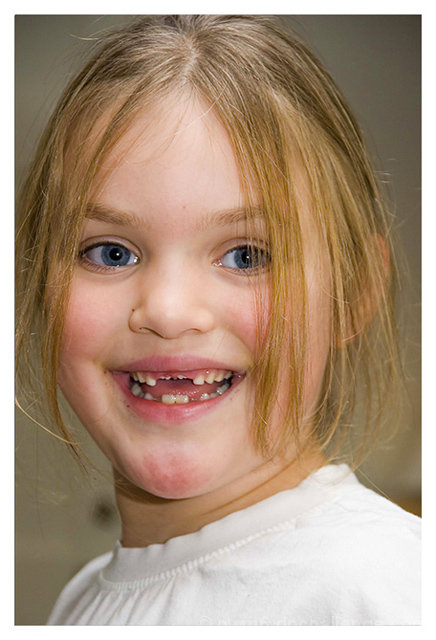
She has a nice expression, and the pose is nice. Composition is good - the bright white shoulder in the foregound is a bit distracting -perhaps a tight shot of just her face would have had more imapct, or tilt the image to add some energy - not to say the voters would have not pounded you for a tilt...it's just it seems not too exciting.
Pretty...this image is not. Not to say anything against the child, but lacking a full set of peraly whites is not pretty. Also, the redness on her face is off-putting, and she could use a hair brushing. Since this was an advanced editing challenge you (IMO) take a score hit for not fixing the redness. The BG is OOF nicely, but some weird (ugly) color, and justinfront of her neck is a black spot - distracting, and draws my eye to her red chin.
THe black spot and her hair infer that this is a quickie shot with little thought or set up - the voters notice and deduct for such a thing whether true or not.
Lighting is good, as in even. Nothing dramatic, but who says it needs to be in every image, right?
I hope you find this critique helpful and it imrpoves your photography.
-chris
such a charming face and smile! great idea for this challenge, with the adult teeth starting to come in. the face has some redness on the chin and forehead that would have been nice to edit out just a bit. such a great, happy, expression...makes me smile just to look at her!






 Add photograph to your favorites
 Add photographer to your favorites

 Photographer found comment helpful.


