i often use the empty space of a challenge i didnt enter (yet) to upload any image to see what it looks like on web
so the end of the withdrawal took me by surprise this time and there it was in the challenge and i didnt even put a title to it
not that the image is that bad but its a bit shallow for a study i agree
i considered a DQ but than again the big red mark it makes isnt a pretty view either and besides im pleased with the fact some people did like the effect i was trying to achieve
so
let it be
Statistics
Place: 417 out of 519 Avg (all users): 4.9091 Avg (commenters): 5.7000 Avg (participants): 4.8278 Avg (non-participants): 5.1667 Views since voting: 681 Views during voting: 399 Votes: 275 Comments: 12 Favorites: 0
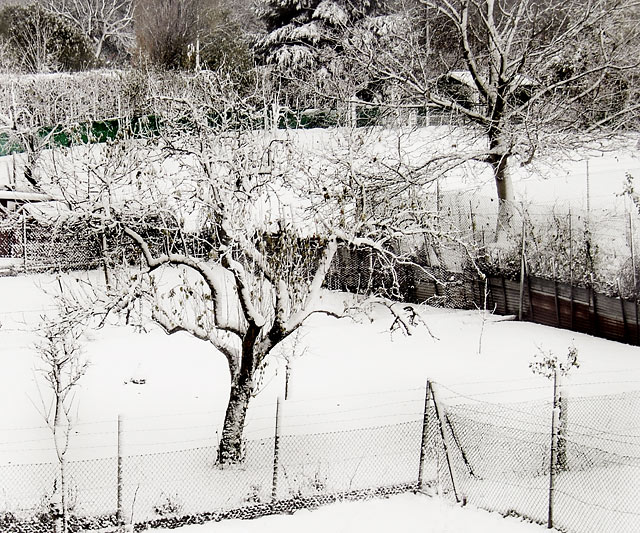
This has the feel of a highly defined charcoal drawing. What a wonderfully executed photo.
The sharpness and contrast is excellent !! Well done and good luck. Hope members stop and take a good look at this.
simple and effective..great realtionship between the trees..the white is almost overwhelming in the same way a load of snow can be, and so this works..very pretty..
This is slightly reminiscent of Kertesz' famous Washington Square shots - making use of the inevitable contrast in the scene to emphasise the graphic world. I don't think it's absolutely successful, though: there are stong elements - the first tree certainly, and the lines of the fences - but it doesn't have quite the clarity of composition to emphasise those lines strongly enough. A good treatment, but it steers to close to cluttered to my eye.






 Add photograph to your favorites
 Add photographer to your favorites


 Photographer found comment helpful.


