Greetings from the critique club! : )
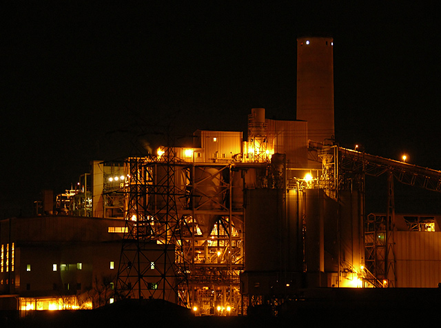
Initial impression upon viewing: "love the light...where's the rest of that tower, though?"
In terms of composition, the image works well for my eye. I like the rise that the tower provides, and the angle back down in the right third of the frame. The lines and lights provide visual interest and energy to the image. The one thing that bothers me when looking at the composition is the almost-disappearing of the electrical tower in the left third of the frame. My eye keeps wanting to either make the tower appear as whole against the building and night sky, or recompose the shot so that the tower is in a less conflicted spot, visually.
I think the focus looks good...the sharpen application worked well with this image. In terms of lighting, that's what really sells this image. Actually, the combination of that wonderful warm glow juxtaposed against the cluster of industrial shapes. There's a spot in the lower left corner of the image that appears to have an odd lighting blur by the office windows...with actually a slightly greenish cast on my monitor...that is a bit distracting to my eye as well. I think the length of your exposure worked well--it gives a warm, almost firey glow to the shot. There are points in the lights that are blown out as a result of the longer exposure (which, around here, some folks may have scored you lower for). Did you experiment with shorter exposures? You may have and decided that the visual effect was stronger with the longer exposure.
In general, I think that this image was a great choice for the "Industrial" challenge. The industrial lines, rich night sky and warm lights combine to make a visually appealing image.
I hope this information is helpful. If you have any questions/feedback about this critique, please feel free to send me a PM.
Cheers to you, and keep shooting! : )
Jeannel |