| Author | Thread |
|
|
12/11/2005 12:28:13 AM |
Hello from the Critique Club!
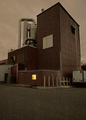
Interesting image. My initial reactions: I'm not sure i like the grain, but it does add to the industrial atmosphere and feeling. ISO 100? And you did not add grain (according to your comments...Hmm. Interesting.) Must be an editing side effect.
The image appears tilted to the right, well, the building seems to lean that way. A bit distracting to my brain.
Overall rather dark, dull and low on contrast. The toning is interesting. I cannot say that it adds or detracts overall, but the low contrast muddy-ness of the image kid of takes over.
Composition is pretty decent. You want the viewer to see the sky (I assume from the title) and that works, but the sky is rather dull - one white cloud. I see no smokestack so some of the conneciton is lost on me. There is a large blank/dull area in the sky, and the white cloud in the lower right that wants to draw my eye.
I sometimes think that nice color shots are changed to b&w or duotone to try and make an average mundane subject more exciting. Starting with a more dynamic image is usually a better option. Not having seen the original capture I cannot say for sure it that is the case here. perhaps there is bright red sign or something very distracting. Obviously you are trying to impart an industrial feeling to the image.
I'd like to see the image straightened a bit to ease the illusion of tilting, perhaps less grain. Definitley more contrast and no or different or perhaps less toning. If you could get more dramatic clouds in the sky that would be the ticket.
|
|
 Photographer found comment helpful. Photographer found comment helpful. |
Comments Made During the Challenge  |
|
|
12/03/2005 10:18:59 PM |
Ooh I was going to get excited by this image, but it'sjust gone a little too flat. the idea of reduced brightness is good but it needs some contrast to lift the highlights
|
|
| Photographer found comment helpful. |
|
|
12/02/2005 11:03:45 AM |
Nice symmetry with the cloud going NE and the building flowing SE.
Rather uninteresting subject however.
|
|
| Photographer found comment helpful. |
|
|
12/02/2005 07:57:40 AM |
|
The grain seems to hurt this photo. Interesting patches of light in the sky. |
|
| Photographer found comment helpful. |
|
|
12/01/2005 01:17:33 PM |
|
| Photographer found comment helpful. |
|
|
12/01/2005 12:40:31 AM |
|
| Photographer found comment helpful. |
|
|
11/30/2005 04:04:13 PM |
|
| Photographer found comment helpful. |
Home -
Challenges -
Community -
League -
Photos -
Cameras -
Lenses -
Learn -
Help -
Terms of Use -
Privacy -
Top ^
DPChallenge, and website content and design, Copyright © 2001-2026 Challenging Technologies, LLC.
All digital photo copyrights belong to the photographers and may not be used without permission.
Current Server Time: 06/29/2026 05:22:19 PM EDT.