| Author | Thread |
Comments Made During the Challenge  |
|
|
11/29/2005 02:34:44 PM |
|
|
|
11/28/2005 03:27:53 PM |
|
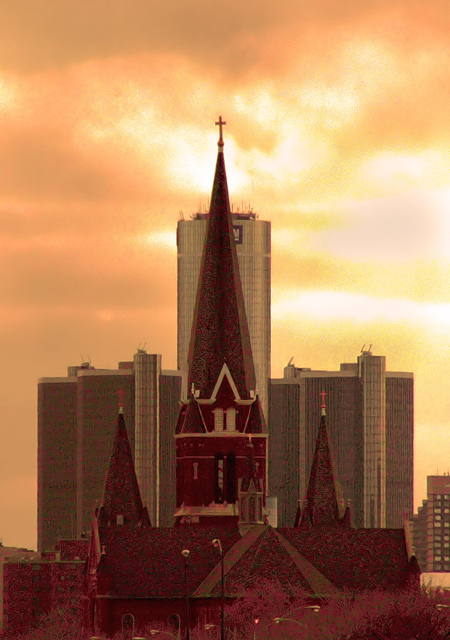
I grew up in Detroit and always wanted to take this photo. I figured I'd run into the same trouble you ran into. It looks a bit over zoomed. A really expensive lens could probably sort that out. Nice Title too. Thanks for submitting this. |
|
 Photographer found comment helpful. Photographer found comment helpful. |
|
|
11/27/2005 08:06:46 PM |
|
too much noise in shadows |
|
|
|
11/26/2005 10:58:41 PM |
|
Incredible sky color and lighting. Like it very much. |
|
| Photographer found comment helpful. |
|
|
11/25/2005 09:26:14 PM |
|
There is alot of pixelation, which is a bit distracting. Nice layout though. |
|
|
|
11/25/2005 05:15:04 PM |
|
You pose an interesting theological dichotomy, but it appears through your uneven presentation. You elevated the spirital above the materalistic and symbolicly represented it 3 to 1. Sorry, just my interpretation. Also you image has a strange distracting red grain. |
|
|
|
11/25/2005 10:31:50 AM |
|
This is a neat idea and cleaverly shot. However, something seems to be wrong. It almost looks like a huge amount of noise? |
|
|
|
11/25/2005 02:21:01 AM |
|
Love the idea. Too bad there is so many noise and grain in the lower half. Else I would have given it a 10, now you will have to do with a 7. |
|
|
|
11/24/2005 08:58:45 AM |
|
Good idea! The noise and drab overall tone kills it, though. |
|
|
|
11/24/2005 05:48:44 AM |
|
Very clever title! A little too noisy for my taste.....7. |
|
|
|
11/23/2005 11:21:37 PM |
|
This looks way over-saturated, not sure if you meant to do that. I think this would be excellent in B&W and the contrast bumped up. Just MHO. |
|
|
|
11/23/2005 05:57:33 PM |
|
Not a bad picture, but there's an awful lot of noise in there. I think you should have considerd cleaning it up a little before entering. |
|
|
|
11/23/2005 04:27:50 PM |
|
Nice juxtaposition of the buildings and theme! The lighting and focus is a little off - somewhat grainy as well. |
|
|
|
11/23/2005 02:46:15 PM |
|
The image looks very grainy possibly from sharpening it too much... |
|
|
|
11/23/2005 02:14:35 PM |
|
Too grainy on the buildings. |
|
|
|
11/23/2005 10:26:34 AM |
|
Great juxtaposition of the buildings, and catchy title. Image looks a noisy, how about trying noise reduction processing, or try a tripod, lower ISO, and longer exposure? |
|
|
|
11/23/2005 09:18:32 AM |
|
A bit over processed on the church |
|
|
|
11/23/2005 08:50:32 AM |
|
I've always wanted to take a picture of the church and Ren Cen just like this! |
|
|
|
11/23/2005 01:22:01 AM |
|
this a great capture.. but just a bit the color u need to adjust, too strong i think. The white area of the cloud there should b more whitening. Just my personal comment anyway, hope u won't mind it. :) I giv 7 |
|
|
|
11/23/2005 12:35:46 AM |
|
High points for composition, but I've got to knock it a bit for the grain. 6 |
|
Home -
Challenges -
Community -
League -
Photos -
Cameras -
Lenses -
Learn -
Help -
Terms of Use -
Privacy -
Top ^
DPChallenge, and website content and design, Copyright © 2001-2026 Challenging Technologies, LLC.
All digital photo copyrights belong to the photographers and may not be used without permission.
Current Server Time: 06/28/2026 11:14:48 AM EDT.