|
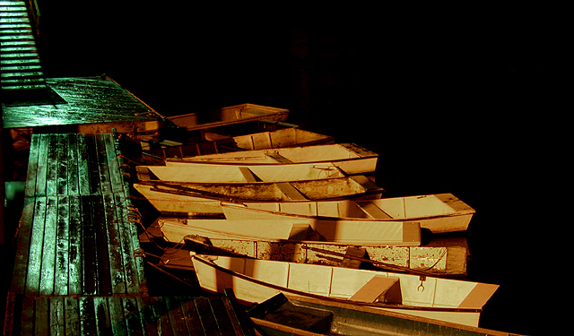
6 - Good concept. Criticism; there is more potential here in my opinion, not sure 'how', and perhaps camera dependent, but this 'feels' a bit harsh and 'rigid', whether it is the lighting (especially the green on the left) or the seemingly lack of 'depth' on the boats, not sure. Perhaps (depending what you had to work with) a little more space to the right and 'above' the boats would have made this better in my opinion. Not sure what that 'something' (reddish color) is in the middle background, but that either enhanced or removed too would also improve this. |






 Add photograph to your favorites
 Add photographer to your favorites


 Photographer found comment helpful.


