| Author | Thread |
Comments Made During the Challenge  |
|
|
11/20/2005 11:23:55 AM |
|
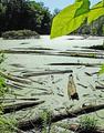
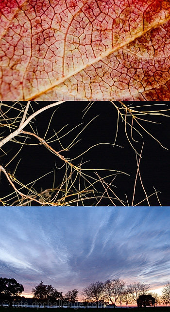
I like the contrasting but complementary images, coloring and liighting and the fact that it's borderless makes that more effective. It tells a story-- 10 |
|
|
|
11/18/2005 05:26:48 PM |
|
i would have prefered the bottom panel to be something close up and abtract like the first two. seems a bit out of place. |
|
|
|
11/17/2005 05:22:37 PM |
|
The subject matter is all Autunm, but the range is too great, I think... maybe it would work better with three types of leaves. |
|
|
|
11/17/2005 10:20:59 AM |
|
|
|
11/17/2005 03:29:31 AM |
|
Very nice, the dark centre shot breaks up the other two nicely. |
|
|
|
11/16/2005 10:27:37 PM |
|
I enjoy each of the photos, and I understand their thematic relation, however they don't seem to go together visually. |
|
|
|
11/16/2005 04:54:23 PM |
the sky in the last one is fab.
good luck |
|
|
|
11/15/2005 04:42:34 PM |
|
Interesting theme. I like it. The center image is the weakest, but it's not too bad. 7 |
|
|
|
11/15/2005 09:27:01 AM |
|
love the way the three photos lead into each other. more border/spacing between them might help them seem less crowded. |
|
|
|
11/14/2005 01:34:16 PM |
|
Interesting take on the challenge, however the images don't seem to "flow" very well (from one to the other). I like the textures in the top image. The middle image doesn't really have much impact. The bottom image is great, but seems a little tilted. |
|
|
|
11/14/2005 07:18:53 AM |
|
Nice triptych. Well done. |
|
|
|
11/14/2005 01:23:07 AM |
|
I love the tope image. It might have worked better to place the bottom image in the middle as the top two are somewhat similar in that they are both close ups. |
|
|
|
11/14/2005 12:33:07 AM |
Fit Challenge Criteria: 1/2
Contrast/Color: 2/2
Composition: 0/2
Photo Quality: 2/2
My Subjective Affinity: 0/2
I really like each individual photo, but they don't work well together IMHO. |
|
Home -
Challenges -
Community -
League -
Photos -
Cameras -
Lenses -
Learn -
Help -
Terms of Use -
Privacy -
Top ^
DPChallenge, and website content and design, Copyright © 2001-2026 Challenging Technologies, LLC.
All digital photo copyrights belong to the photographers and may not be used without permission.
Current Server Time: 06/28/2026 11:45:01 PM EDT.