Some of the pictures in this challenge would have been so beautiful if the subject had been focused properly. Unfortunately this is another photo I would have liked a lot more if the focus was right.
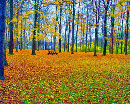
I like the composition of this shot...but some of the colors seem unnaturally bright to me. The trees on the left have something of a blue tinge to them. I like the picnic table in this shot...makes me want to pack a lunch and go hiking :-)
3 - I like the potential. Criticism; definitely at least 640, preferably width at least. Not sure what you did with the sat/contrast, but the tree on the left looks 'too blue', while you may have been going for a certain look/feel with that, it is not enhanced by the fact you cropped half the tree out. A different crop, slight nudge rotation up on the right and as stated 'bigger', would have made this shot much better in my opinion.
I like the rich colors, especially the blue trees, but somewhere along the line everything ended up fuzzy, blurred, whatever. Spoiled an otherewise great shot.
too small, odd colors - probably intentional, but not to my liking. Very poor composition - tilted, centered horizon line, the table is off center but not in a 1/3 location. this had potential...but too many basic flaws. Learn from this and you'll knock us dead in a few challenges!






 Add photograph to your favorites
 Add photographer to your favorites


 Photographer found comment helpful.


