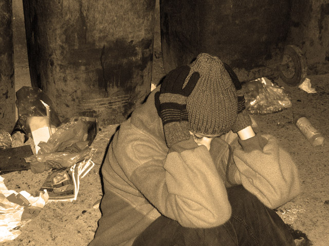
I remember thinking about this one during the challenge. It's a great emotive shot, and I personally like the fact that she's 'shutting us out', to me, the situation is one of aloneness and hardship. One thing that somewhat put me off is that since the title of the challenge is 'garbage' and the main focus of the image is a homeless person, it could be interpreted as a statement about the 'waste/garbage of society'... though I don't think (I hope and your title indicates) that was the intent. Nevertheless, the implication bothered me.
On a photographic note, I do think the lighting was a bit intense, as the shadow right behind her is the only really stark/black part of the image.
I like the composition, although I think we want to see a little more of her? face. It's sorta nice she's shutting us out a bit, but we want to see the emotion. I have a hunch this is staged as her clothes look pretty clean and new. :)
I think the sepia isn't doing you any favors. B&W would have been better. I always ask what purpose I'm trying to accomplish when I add an effect. If it's just to "look cool", I usually wind up going with simpler. It almost always works better.
The lighting is a bit harsh too. Looks like a utility light which casts harsh dark shadows. I think dark shadows would be good in this pic, but they aren't utilized at all. Side lighting might be more dramatic here.
Very moody shot, I wish she was more a part of this picture, maybe just crop a little lower and more on the right side, anyway thats just a matter of taste. Like the colour tone here works well with this.
Might have been better if the girl actually looked poor and destitute instead of in almost brand new, nice clothes. Also, the centered position of the girl doesn't add any strength to this picture. Sepia is a good choice.







 Add photograph to your favorites
 Add photographer to your favorites

 Photographer found comment helpful.


