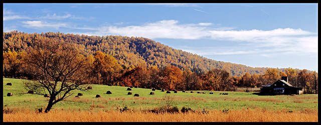
Wow, lovely landscape. I like the inclusion of the house. Too bad the tree on the left blends in so much with the foilage in the background, could have been a nice contrast if it stood out more. Colors are a little over saturated as well (IMO).
6 - Criticism; frame is too 'heavy' for this in my opinion. Like to see it perhaps 'bigger' (height obviously), with more 'fore grass' - just think the size restrictions mean you lose too much for this shot in the Challenge, therefore turn it into a 'different shot', maybe, depending what you had. Sure it looks much better 'wider'.






 Add photograph to your favorites
 Add photographer to your favorites


