| Author | Thread |
|
|
11/22/2005 11:06:44 AM |
Originally posted by Alienyst:
Hello from the Critique Club!
I have studied your image and have the following to offer:
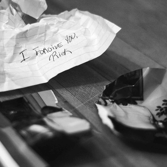
Composition/perspective - I get the concept you are going for, but the picture in the foreground is more of a distraction. It takes a while to get what it is and by then your attention has been drawn away from the main subject, the note. Compositionally, I feel this could have been a much stronger image without the pitcure and the note placed such that is looks 'thrown away' (see below) or the bottom third of the picture cropped out to make it less of a distraction and keep attention on the note. Your angle of approach is good to the subject allowing for spot on focus in that area with good detail - the wrinkles in the paper, etc. (see below) The text is placed well by rule of thirds in this crop.
Color - b/w, nice contrasts and balance between the black/darker areas and the white/lighter areas. The shadows blend nicely with and help balance the papers white.
Lighting - well controlled lighting and good placement. There are not blown out areas on the paper, the strongest white, and the lighting is not overpowering as the wrinkles and ruled lines are still plainly visible. The shadows are not overpowering and on and around the paper enhance the scene.
Challenge requirements - the requirement was for 'garbage.' The composition here does not necessarily portray garbage. If the note and or picture were say, in a waste basket, this would be garbage as well as support your title better as well. I think this is where this image fell short a bit.
Overall/my opinion - with a different composition this would be a much stronger image not only for the challenge requirements, but on its own as well. The theme is there and the realization of the idea is well done. Removing the distractions would help bring out the emotive force as well. |
Thank you very much for your indepth critique it is much appreciated!
I will take everything you said into account in the future to make stronger images.
the only thing i can't agree with is that it doesn't fit into the context of the challenge as well as some would have liked.
Its a crumpled up letter and a torn picture on the ground. To me that implies garbage. As well the title "break up?" adds information that this is a relationship in trouble. I think people take the challenge subjet to litterally. Here we have figuratively a relationship "thrown in the garbage" and litteraly garbage on the ground.
thanks again for your critique!
Steve |
|
|
|
11/22/2005 08:34:50 AM |
Hello from the Critique Club!
I have studied your image and have the following to offer:
Composition/perspective - I get the concept you are going for, but the picture in the foreground is more of a distraction. It takes a while to get what it is and by then your attention has been drawn away from the main subject, the note. Compositionally, I feel this could have been a much stronger image without the pitcure and the note placed such that is looks 'thrown away' (see below) or the bottom third of the picture cropped out to make it less of a distraction and keep attention on the note. Your angle of approach is good to the subject allowing for spot on focus in that area with good detail - the wrinkles in the paper, etc. (see below) The text is placed well by rule of thirds in this crop.
Color - b/w, nice contrasts and balance between the black/darker areas and the white/lighter areas. The shadows blend nicely with and help balance the papers white.
Lighting - well controlled lighting and good placement. There are not blown out areas on the paper, the strongest white, and the lighting is not overpowering as the wrinkles and ruled lines are still plainly visible. The shadows are not overpowering and on and around the paper enhance the scene.
Challenge requirements - the requirement was for 'garbage.' The composition here does not necessarily portray garbage. If the note and or picture were say, in a waste basket, this would be garbage as well as support your title better as well. I think this is where this image fell short a bit.
Overall/my opinion - with a different composition this would be a much stronger image not only for the challenge requirements, but on its own as well. The theme is there and the realization of the idea is well done. Removing the distractions would help bring out the emotive force as well. |
|
 Photographer found comment helpful. Photographer found comment helpful. |
Comments Made During the Challenge  |
|
|
11/15/2005 07:08:09 AM |
|
a nice shot. a bit questionable how closely it fits with the theme, but nice picture. |
|
|
|
11/13/2005 09:48:50 PM |
|
it is a good idea, i wish you could see the torn picture more clearly, and good choice going black and white. |
|
| Photographer found comment helpful. |
|
|
11/11/2005 08:34:14 PM |
|
Interesting, I'd like to see a greater depth of field. I don't know what the items are in the foreground, they are fuzzy. |
|
| Photographer found comment helpful. |
|
|
11/10/2005 06:58:49 PM |
|
ooh. love how the photograph turned out in your image. |
|
| Photographer found comment helpful. |
|
|
11/10/2005 05:36:57 AM |
|
|
|
11/09/2005 02:23:53 PM |
|
nice idea...i think i would have liked it a little more if the papers were in a trashcan of some sort or paper shredder |
|
| Photographer found comment helpful. |
|
|
11/09/2005 12:37:01 PM |
|
This doesn't really yell 'garbage' at me, but I like the composition and DOF. |
|
| Photographer found comment helpful. |
|
|
11/09/2005 12:05:04 PM |
|
wow, that is an exceptionally well done emotive photo. leaves so may questions unanswered, and thus provides more interes. the ripped up photo further re-inforces the effect, short depth of field leading you to the note works well. |
|
| Photographer found comment helpful. |
Home -
Challenges -
Community -
League -
Photos -
Cameras -
Lenses -
Learn -
Help -
Terms of Use -
Privacy -
Top ^
DPChallenge, and website content and design, Copyright © 2001-2026 Challenging Technologies, LLC.
All digital photo copyrights belong to the photographers and may not be used without permission.
Current Server Time: 06/28/2026 06:42:45 AM EDT.