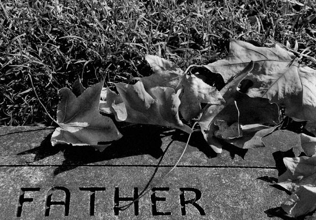
I didn't look at the comments before leaving my own. I gave this a 6 in the original voting. I think the composition is good with the Father being at the bottom. However, a tigher crop so there is less grass may have been good. Cut the picture just above the top of the leaves. You get grass to the left, but not too much. I'd also add just a touch more stone beneath the Father.
I'm finding a common theme among these pictures I'm commenting on and that is low contrast. I went into photoshop and think this pic has much more pop if you go into levels and change them to 20/1.00/215. This, in essence, adds contrast and I think it looks better.
Interesting take on the challenge and it works for me on a different level.
Perhaps a bit lighter in the highlights but otherwise a well done entry... :)





 Add photograph to your favorites
 Add photographer to your favorites


 Photographer found comment helpful.


