Critque club**
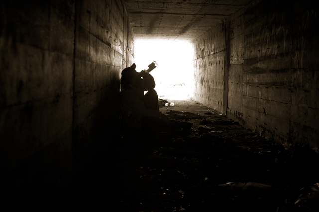
nice shot i like the idea and everything but its kind of hard to see... I like the silheouhte ( sp?) but i think the background is just tooo bright for me. one thing i am going to suggest for you is next time try to have the lines perfectly balanced, if you notice the vertical lines are crooked, they should always point straight up and down..there is a tutorial on this site on making your picture straight.
Nice silhouette and concept. IMHO, I might have cropped it more on the left side so the back fo the figure is against the edge of the photo and hence against the wall more... well done!
I tried to do a similar shot and couldn't get the lighting down the way you have with yours. The tunnel and the shadowed image works well together and is enhanced by the sepia tone. Well Done --7--





 Add photograph to your favorites
 Add photographer to your favorites


 Photographer found comment helpful.
