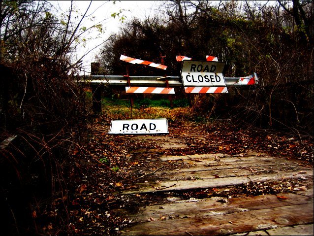
I agree the picture is saturated. I however thought it was supposed to be that way. The combination of the Road Closed signs, the broken state of the sign on the left and the over all dark tone all add to the idea of this area being long forgotten. I personally like it. Great job.
There's something about this that really appeals to me. Maybe its the contrast between the obvious "dead end" and accompanying dead brush, and the pretty fall colors. I think you've also done a great job editing. Good luck!






 Add photograph to your favorites
 Add photographer to your favorites

 Photographer found comment helpful.


