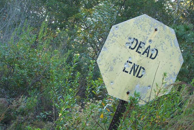
The diagonal orientation doesn't do much for me in this case. Colors look washed out. I really like the sign. I think this would have been better with some work on the color.
The low saturation on the sign contrasts too strongly with the relatively lush looking vegetation. Since this was an advanced editing challenge you might have tried masking the sign, inverting the selection and burning the background, then hue shifting the color of the sign toward a rusty red.







 Add photograph to your favorites
 Add photographer to your favorites


 Photographer found comment helpful.


