| Author | Thread |
Comments Made During the Challenge  |
|
|
11/15/2005 07:26:16 PM |
|
i really like the borded and the black and white! well done! |
|
|
|
11/14/2005 11:23:31 PM |
|
great picture but the big black border draws my eyes outward away from your beautiful work. 7 |
|
|
|
11/14/2005 07:28:51 PM |
|
Needs more contrast but I like the idea. |
|
|
|
11/13/2005 08:28:15 PM |
|
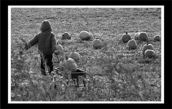
The blurrede bushes in the foreground really pull my eye away from this sweet child and her cart and the pumpkin patch. The composition would be stronger if she was placed in the right hand vertical thirds area. |
|
|
|
11/12/2005 10:47:04 AM |
|
great pic, doesn't quite have the landscap feeling but still nice |
|
|
|
11/11/2005 11:55:57 PM |
|
This doesn't really say landscape to me (more of an emotive candid) and the border is very distracting. |
|
|
|
11/11/2005 11:48:48 PM |
|
I dont think this qualifies as a landscape. |
|
|
|
11/11/2005 10:46:00 PM |
|
Love this shot, borders a bit thick for my taste but I'm not taking off for that. I would have loved to see this in color. |
|
|
|
11/11/2005 07:58:38 PM |
|
I think your borders should be much smaller. |
|
|
|
11/11/2005 11:54:09 AM |
|
Very nice photo, but I am not sure I would call it a "landscape". I suppose it's a matter of interpretation. Looks like it was a fun time. |
|
|
|
11/11/2005 10:36:39 AM |
|
|
|
11/11/2005 07:11:50 AM |
The border is too thick and the white should be a thin strip.
9 |
|
|
|
11/11/2005 06:36:47 AM |
|
too much border, takes away from the image. like the b&w used here |
|
|
|
11/10/2005 07:45:17 AM |
|
great photo - made me smile |
|
|
|
11/09/2005 10:57:20 PM |
|
|
|
11/09/2005 10:59:40 AM |
|
Not to sure about the frame. I like the composition here. |
|
|
|
11/09/2005 05:10:07 AM |
It's a fun shot though I'd somewhat like to see the kid's face instead of his back. The editing seems nice and B&W suits it fine.
It doesn't fit the challenge though. |
|
Home -
Challenges -
Community -
League -
Photos -
Cameras -
Lenses -
Learn -
Help -
Terms of Use -
Privacy -
Top ^
DPChallenge, and website content and design, Copyright © 2001-2026 Challenging Technologies, LLC.
All digital photo copyrights belong to the photographers and may not be used without permission.
Current Server Time: 06/28/2026 08:23:33 PM EDT.