I wouldn't worry too much about your place... this was a rather high scoring challenge overall. A 4.6 isn't bad at all for a first entry. It takes a little while to figure out what works here.
I think it's a good picture. Not great, definatley not horrible.
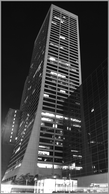
My argument for getting rid of the motion blur, either with a crop, or with faster shutter speed, is that it detracts from the point of the photo, which is the transparency of the first building. You don't want people being distracted by the cars. If you had cropped that out then you could have metered the exposure for the building and lightened the whole thing up a little bit.
This was my first challenge...and I didn't think I would end in the last 10 with this picture. The sens I gave to Transparency is something we could look through and the illusion there is that the first building is transparent...
Regarding the choice between B&W and color I thought that the B&W was highlighting the transparency.
For the motion blur I'm actually mixed as I think that without it the picture would have been too dark.
Thanks all for your votes...Good thing is that I can just improve...or can I? :D
A neat shot, but in this case the motion blur from the cars is distracting. I'll bump you up a point on a second look, as I didn't actually see the transparency the first go around.
I question the conversion to B&W. It doesn't add anything, and I think the shot may have been better as a color photo.





 Add photograph to your favorites
 Add photographer to your favorites


 Photographer found comment helpful.


