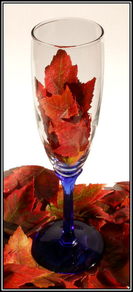
What a lovely idea for the shot and a very nice overall set up. I really like the idea of the leaves in the glass and the glass on the leaves. They compliment each other that way.
Looking at the shot the first things that jump out at me is the contrast between the background (nice and white) and inside the glass near the leaves (lots of gray tones). Not sure if that's the glass or the light going through the glass. If the color inside the glass area was as white as the background, showing only the borders I'm betting this would have jumped at least another point. And if the entire glass was clear, with no blue on the bottom, really showing the leaves all the way through, top to bottom. The blue is nice but doesn't really work with the colors you have presented. This was an advanced editing so you could change the color of the upper part of the glass so it's as white as the background. If you do play with this at all and change that I would love to see the results, I bet it would be stunning overall.
I like your work so far, you've been improving right along and I can't wait to see more of your work in the future.
Hope my comments help and good luck in future challenges.




 Add photograph to your favorites
 Add photographer to your favorites

 Photographer found comment helpful.


