| Author | Thread |
Comments Made During the Challenge  |
|
|
10/29/2005 11:15:11 PM |
|
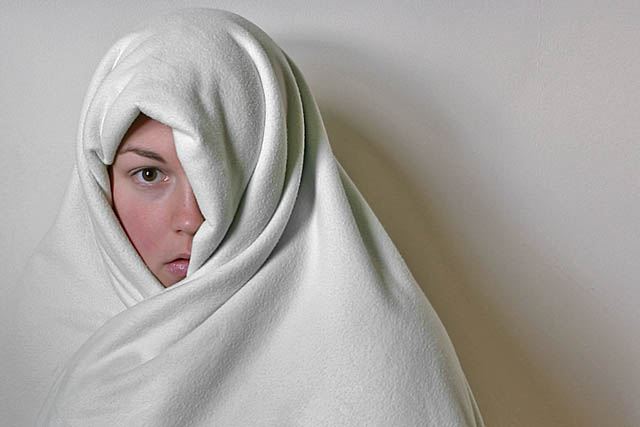
I like it. Nice focus & composition. I think I would have liked it more though, if the backdrop were a little further back so there was less shadow on it. |
|
 Photographer found comment helpful. Photographer found comment helpful. |
|
|
10/28/2005 05:40:25 AM |
|
Nicely done. A smile on the model would have spoilt it for me. |
|
|
|
10/27/2005 06:22:46 PM |
|
Nice concept! I think this shot could be better if you had some softer light and eliminated the shadow. Maybe have your subject stand a bit further away from the wall and have a light shining on the wall to subdue the shadow. |
|
|
|
10/27/2005 04:16:02 PM |
|
IMO cropped to have the face more prominant would improve this, avoiding the shadows on the wall which detract from it, |
|
|
|
10/27/2005 12:59:45 AM |
|
This would be terrific with really tight cropping around the head and including the most prominent folds on the cloth. |
|
|
|
10/26/2005 10:53:06 PM |
|
Haunting and pure at the same time. I love the lighting and composition. Very natural looking model - no make up or smoothing of her skin. I prefer this over skin textures smoothed out during editing. 10 |
|
|
|
10/26/2005 05:20:28 PM |
|
I love this shot! The framing is great, very compelling! |
|
|
|
10/26/2005 02:35:54 PM |
|
You read the theme right. This would have more dynamism if she had been wrapped in furs. |
|
|
|
10/26/2005 08:26:31 AM |
|
good compo. lighting could be better, loose the shadows on the right, brighten it up a bit, and this would be a much better image. |
|
Theme:
Classic /
Light /
Dark
Home -
Challenges -
Community -
League -
Photos -
Cameras -
Lenses -
Learn -
Help -
Terms of Use -
Privacy -
Top ^
DPChallenge, and website content and design, Copyright © 2001-2026 Challenging Technologies, LLC.
All digital photo copyrights belong to the photographers and may not be used without permission.
Current Server Time: 10/01/2026 04:11:57 AM EDT.







 Add photograph to your favorites
 Add photographer to your favorites


