Author Thread Comments Made During the Challenge
Post actions
Post actions
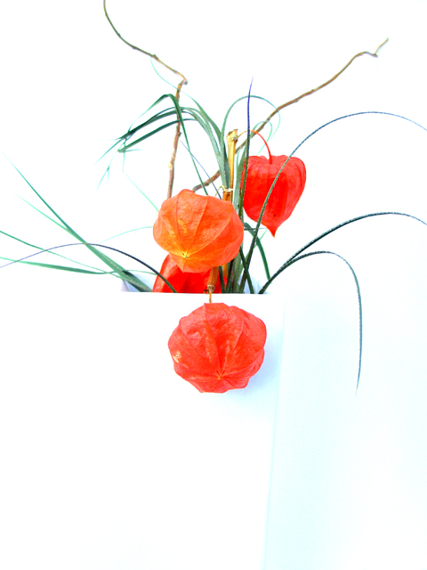
Not bad..But vase shines too much..
Post actions
I think that the vase should be a bit more visible, or at least the back inside edge.
Post actions
A very good challenge entry... Some may think it's too contrasty but I think it works very well... :)
Post actions
Great comp, but lost the left edge of the vase.
Post actions
Really good idea and colors, but vase blends in too much with background. Otherwise I love it.
Post actions
IMO this is too much color to be "light", and I wish the flowers were not all centered.
Post actions
I love this image, but I wish the tis f the leaves weren't cut off. I also would like to see a little more of the vase outline. Very dramatic with the rich red tones. 8
Post actions
Do you consider the vase to be the subject because the redness will always draw the eye and seems the more obvious subject.
Post actions
Nice picture, amazing how the vase disappears to the point you can't really see it at all.
Post actions
Nice pic with lots of colors. Wish it was "light" on white. 5.
Post actions
the problem is that u need something light on white and those flowers or whatever they are,are not really light,are they?but it would be a cool picture.






 Add photograph to your favorites
 Add photographer to your favorites


 Photographer found comment helpful.


