| Author | Thread |
|
|
11/17/2005 08:54:08 AM |
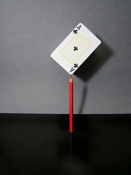
This is a very cool image with a lot of potential. I'm curious to how you did this and your picture link below isn't working :(
But I do like this idea and concept very much. Just a few minor things, if corrected could have put this much closer to the top. I like the bright lighting as it shows there are no strings attached to the card and it really adds to the mystery of the technique. The problem is, as stated before the background. Maybe if you had an all white backdrop so you could see the entire shadow, that would be wicked to me and bring out the white in the backdrop so it really pops out at you. The black and gray doesn't work because it's competing for my attention and the line that cuts across is very distracting to me. One other thing, maybe a different crop, all the space on the left is wasted to me personally, there is nothing there for my attention and it doesn't really add to the shot, but if you moved the space to the right and extended the shadow of the card and pencil to the right so you have the physical card and pencil on the left leading me in and the shadow of the card and pencil leading me out............... Just a thought. I would love to see how this was done AND if you ever try it again, I would love to see the results.
Deannda
Hope my comments help |
|
 Photographer found comment helpful. Photographer found comment helpful. |
|
|
11/06/2005 06:01:02 PM |
Greetings from the Critique Club
Nice composition very creative.
Now as for lighting its to strong...you have too much shadowing going on. Also not sure what is up with your background but it doesn't work too bad you don't have the same black in the back as you have under the pencil.
As for being delicate I can see it here. It fits the challenge.
Hope to see a lot more of this type of creativity from you in the future. |
|
| Photographer found comment helpful. |
|
|
11/03/2005 06:18:06 PM |
Take a look...

Originally posted by lindes:
Yeah, OK, I'll bite. How'd you pull that off? :-)
|
|
|
Comments Made During the Challenge  |
|
|
11/01/2005 11:34:17 PM |
|
Yeah, OK, I'll bite. How'd you pull that off? :-) |
|
| Photographer found comment helpful. |
|
|
11/01/2005 11:20:10 PM |
|
Looks a bit over sharpened |
|
| Photographer found comment helpful. |
|
|
10/31/2005 01:12:09 PM |
|
Intesting idea. I would like the card would be turned a bit to look more natural |
|
| Photographer found comment helpful. |
|
|
10/30/2005 10:16:42 AM |
|
good idea, but a bit over sharpened |
|
| Photographer found comment helpful. |
|
|
10/29/2005 10:21:49 AM |
|
GREAT IDEA! Looks like you had some problems with resizing. I see many pixles. I would have cropped out the bottom of the image, the negative space under the pencil isn't needed. |
|
| Photographer found comment helpful. |
|
|
10/28/2005 11:56:25 AM |
|
This photo looks a little too sharpened. Still cool, but not as great quality. |
|
| Photographer found comment helpful. |
|
|
10/28/2005 11:01:03 AM |
|
Cool idea but your lighting is off....too harsh |
|
| Photographer found comment helpful. |
|
|
10/26/2005 11:44:14 PM |
|
Clever idea. Maybe a bit oversharpened? I wonder if it would do better with a bit of Neat Image? |
|
| Photographer found comment helpful. |
|
|
10/26/2005 08:23:25 PM |
|
| Photographer found comment helpful. |
|
|
10/26/2005 06:13:57 PM |
nice idea, too bad about harsh shadow and bad artifacting around objects. i would have given an 8 otherwise, but with the problems.. a 5.
|
|
| Photographer found comment helpful. |
|
|
10/26/2005 11:44:44 AM |
|
| Photographer found comment helpful. |
|
|
10/26/2005 01:56:55 AM |
|
Nice idea. Personally I would have gone with a more central crop, though. |
|
| Photographer found comment helpful. |
|
|
10/26/2005 01:51:21 AM |
|
Great concept, photo is too soft for me |
|
| Photographer found comment helpful. |
Home -
Challenges -
Community -
League -
Photos -
Cameras -
Lenses -
Learn -
Help -
Terms of Use -
Privacy -
Top ^
DPChallenge, and website content and design, Copyright © 2001-2026 Challenging Technologies, LLC.
All digital photo copyrights belong to the photographers and may not be used without permission.
Current Server Time: 06/28/2026 09:22:45 AM EDT.