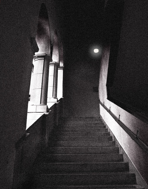
This is a careful & effective composition, combining shapes, lines and tones beautifully and effortlessly. Oddly, although I can understand the role of the grain, I actually think it might detract a little, because it 'flattens' the scene out, and robs it of the sense of depth implicit in the lines ... makes it look a little like a painted theatrical backdrop. Still a nice image though. 7
The composition is off in this image. I can't quite put it into words but this feels off balance and leads my eyes everywhere but no where in particular.
I find that the grain detracts here from an otherwise fantastic image. The grain is starting to look a bit like unwanted noise... There are photoshop-actions available on the internet that can help in applying grain to an image in a way that creates a much more varied (between the highlights and shadows), natural looking result.






 Add photograph to your favorites
 Add photographer to your favorites


 Photographer found comment helpful.


