This was a great challenge
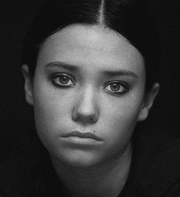
I played with different textures all week
I am very happy with my final choice .
Thanks to my model for once again putting up with me
Statistics
Place: 34 out of 274 Avg (all users): 5.9590 Avg (commenters): 7.4000 Avg (participants): 5.8512 Avg (non-participants): 6.1351 Views since voting: 2177 Views during voting: 400 Votes: 195 Comments: 15 Favorites: 2 (view)
A very beautiful and emotive portrait. Her expression really make this work. The low-key lighting complements the mood perfectly and shows off the 3-dimensional form of her face, making the photo look very real. Using black and white with grain counters the realism and adds to the overall mood. But I also find the grain distracting; perhaps a bit overdone. Nonetheless, a great photo that I have enjoyed examining very much.
That was one of my highest ranked photos in this challenge, I don't know what it's doing here down in the 30s! But whatever DPCers think, you and your lovely model have made a photo you can be very proud of.
Grain would never allow such clear catchlights, but employed with artistic licence as in this case, it makes this portrait sing. Good work. Returning for final bump.
this is a great shot, i feel however that grain should add to the photo without being the subject of, or the main thing, in the photo....
it is really sad but this image even as good as it is, looks like it has fog of grain over it, instead (as it is with true grain in film) the grain being on the same plan as the subject...i have shot alot with film and alot with grain and using it as part of the composition, and i feel that this is just over kill even to ASA 1600 film and if i push it @ 800 it just doesn't do that to the photo....i think u really could've had a truly classicly great looking shot if u had only cut through it with some contrast, or just have backed it off alittle......
i really hate to do this to such a great image but its too far, would be a 7/8 instead i have to give it a 6, b/c your use of grain is distracting and not an adition to your overall image
I think that this image would benefit from a more varied and natural looking grain. There are Photoshop-actions to help achieve this. If you look at the grain on a non-digital b+w print you'll see that grain is not an even speckle spread over the image. Spread evenly like this and grain tends to start looking like digital noise. A stunning portrait though.
What a great portrait! She has a timeless face and she is perfectly lit! well done. I wonder is a different crop (cut a bit on the left) might accentuate her face tilt?
Love this face.....hate seeing it sad for any reason....wonderful drama and super use of Grain.........wish I could vote .wwwwwwwwwwwwwwwwwwwwwwwwwwwwW
I think I recognize this model from someone's portfolio, but I cannot remember who on earth it was...
Lovely image, the centered comp may not work for some ppl here, but I like it. :)







 Add photograph to your favorites
 Add photographer to your favorites

 Photographer found comment helpful.


