| Author | Thread |
|
|
11/02/2005 09:06:49 AM |
Originally posted by smilebig4me1x:
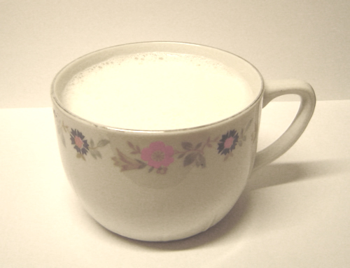
I am going to comment on this and i will try to be as gentle but honest as possiable. from where im sitting this photo needs alot of help. IMHO this is going to score very low as I can not give you more than a 4 and this is why:
color: looks more yellow- if you go to selective color(I have ps so i will use that as my reference) and go under the yellow setting you can adjust it to more of a white color then go to the white and lower the black levels to get a truer white.(this will also help with the milk color)
for this subject i would suggest a rule of thirds to give it more interest factor. the centered crop doesnt do this beautiful tea cup any justice.
your lighting seems ok but there is a bit of a hot spot(spot where light is the strongest and is blown out with little to no detail) try backing up your light source and placing a second one on the other side for more even lighting. I hope i have helped you as that is my only intention. If you have any questions about what i mentioned here please feel free to PM me anytime. good luck and have a great day! |
thanx a lot for your helpfuly comment. I know, it's not a nice pic and I don't know, why I chose this because I had an other, better photo.
have a nice day, soeren |
|
|
|
11/02/2005 09:05:21 AM |
Message edited by author 2005-11-02 09:06:21. |
|
Comments Made During the Challenge  |
|
|
10/27/2005 09:09:50 PM |
|
love life, taste the freshness... drink milik, love life... DRINK MILK :D nice, but a bit grainey and that bit of shaddow kind of distracts the eye |
|
 Photographer found comment helpful. Photographer found comment helpful. |
|
|
10/27/2005 02:01:16 PM |
|
The picture seems to have a yellow tint to it. Levels or yellow desat might have helped. |
|
| Photographer found comment helpful. |
|
|
10/26/2005 10:19:59 AM |
I am going to comment on this and i will try to be as gentle but honest as possiable. from where im sitting this photo needs alot of help. IMHO this is going to score very low as I can not give you more than a 4 and this is why:
color: looks more yellow- if you go to selective color(I have ps so i will use that as my reference) and go under the yellow setting you can adjust it to more of a white color then go to the white and lower the black levels to get a truer white.(this will also help with the milk color)
for this subject i would suggest a rule of thirds to give it more interest factor. the centered crop doesnt do this beautiful tea cup any justice.
your lighting seems ok but there is a bit of a hot spot(spot where light is the strongest and is blown out with little to no detail) try backing up your light source and placing a second one on the other side for more even lighting. I hope i have helped you as that is my only intention. If you have any questions about what i mentioned here please feel free to PM me anytime. good luck and have a great day! |
|
| Photographer found comment helpful. |
|
|
10/26/2005 10:01:51 AM |
|
This has no visual appeal whatsoever. It isn't tack sharp, the cup is dead centered like a target and the background doesn't appear that white. Maybe take an interesting piece of stemware, place it to one side using the rule of thirds, have a really focused image and go from there. To clean up the beigy tones of the background, use a selective color adjustment and remove the black, cyan, magenta and yellow. |
|
| Photographer found comment helpful. |
Home -
Challenges -
Community -
League -
Photos -
Cameras -
Lenses -
Learn -
Help -
Terms of Use -
Privacy -
Top ^
DPChallenge, and website content and design, Copyright © 2001-2026 Challenging Technologies, LLC.
All digital photo copyrights belong to the photographers and may not be used without permission.
Current Server Time: 07/02/2026 10:05:03 PM EDT.