critque club**
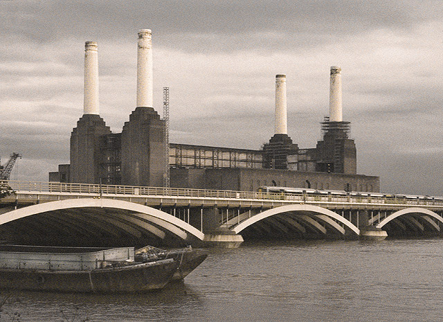
I love the clouds but that was not the first thing to come to my attention, the boats are over powering because they play some form of directional line role towards the image..you have nice use of lines but none of them play a role together..you have pipes point upward and then a bridge pointing down the page and a boat pointing to archs..I've learned that the use of lines have to lead you to something and in this photo none of them lead you to anything. what might have worked is have the crane your main subject and have its line lead you towards the pipes OR if you wanted to use the boats as your main subject have it be within the archs to have your main subject the boat. it is hard to work on moving subject like the boat though..
over all you did a excellent job using grain but 1600 is way too high of an ISO
This might be odd, but what immediately caught my eye about your photo were the two boats, then the three design elements of the bridge and then the four white stacks. Good composition and the grain gives it an older-world kind of feeling. 8
i really like the lighting. my first impression was the boat blends in too much with the curve of the bridge. i wish it was on a different angle to help add more dynamic to the pic
The grain helps to give this image a feeling of not only a bygone era but desolation. I have looked a couple of times and in my opinion I think you have succeeded in what you intended to capture.
Interesting shot. The grain is very subtle, but there. It almost shouldn't quite work. But it does make me start thinking art deco. Which evokes the mood, which is part of what makes grain cool. :) The crane to the left is a smidge distracting and might benifit from cropping out. Otherwise, very neat image. 7







 Add photograph to your favorites
 Add photographer to your favorites

 Photographer found comment helpful.


