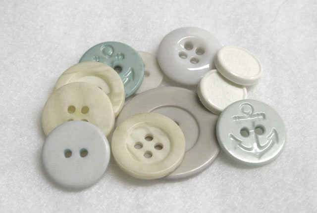
5 - Liked the concept. Technically, while no 'expert', seems to be you have done well to retain the 'surface' of the buttons (especially the white right rear ones) without 'blowing'. Criticism; I think that a sharper, or even 'direct on' angle, and a more bland background, may have made this better in my opinion. The marble (?) 'base' was perhaps not 'white enough' in my opinion when I voted for the Challenge, so either a greater depth achieved using this one (somehow) in order that you could have adjusted the color, or else using as I said, a blander (and whiter) 'base'. I agree with the comments made (and while perhaps 'rewording' required, also the 'more creative' one) and think that perhaps use of some 'space' somewhere may have helped this. The thing that I 'liked' most about this shot was the 'difficulty' you likely had 'technically' with those buttons for the Challenge. Perhaps a different crop too, again possibly the 'space' issue.
I agree with Jutilda. She has a good eye and is a very honest critic. I passed over this one as it just didn't hold my interest. Yes, it fit the challenge but it just wasn't eye-catching and the composition is too centered (snapshot-like, rather than artistic)
This just doesn't have any visual appeal. Just a bunch of buttons piled on a blanket or something. For this to be artful, it needs something to make the viewer want to spend more time. Maybe a single pale pink button on a solid flat, untextured background with perhaps a need threaded with pale pink thread (or blue, or whatever) leading up to it, with lots of negative space.... Just a thought.






 Add photograph to your favorites
 Add photographer to your favorites

 Photographer found comment helpful.


