critque club**
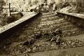
I like this shot, it looks like it might be a bit over exposed the weeds are too bright imo. although i cant see what all you did with it in photoshop I think a better frame might have looked a tad nicer.
the lighting on your main subject is ok, the texture is there but it could need a bit more contrast
I like the overall feel to it, its very dramatic, the lines flow nicely but one thing i suggest to you is when you have vertical lines (the background) it is best to have them show up straight up and down. there is a tutorial i believe on this site on making lines straight to help the image a bit.
This looks like Jutilda's style lately. I like the subject as one for grain. The grain is difficult to see versus the texture of the wood, but I think there is enough there. The vanishing border adds to the old feeling too. 8







 Add photograph to your favorites
 Add photographer to your favorites

 Photographer found comment helpful.


