Greetings from the Critique Club
One of the fun things about the Critique Club is that when I push the button, I never know what image is going to come up on the screen. When I saw this one, it was an immediate "ohhh! Nice."
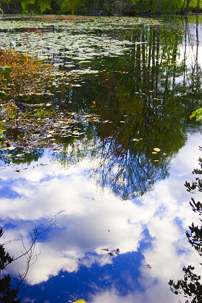
I very much like the contrast between the blue sky reflection and the green trees & floating stuff. Yes, some of your comments say the blue is a little over the top, and perhaps it is. Nevertheless, the contrast is pleasing.
The two thoughts I have on this:
First - Border patrol. The bits of branches to the lower left and right and the 1/8th of a yellow leaf at the bottom work against this nice image. If you could try for a slightly different angle, it would help a good deal.
Then - compositionally, your image is very nearly half 'n half blue and green. It's tough for a viewer to decide which is more important to look at. (do you want to emphasize the tree/shoreline, or the blue sky?) So, usually, after a brief struggle, the viewer just moves on. Not what you want to have happen.
I enjoyed looking at your image and wish you continued success at DPC. You're doing fine. |