| Author | Thread |
|
|
06/24/2003 06:26:35 PM |
*Critique Club*
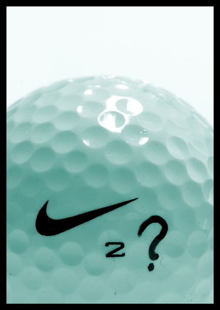
I like that even though we think that this shot would be overwhelmed with white, the shot isn't. It's got a blue tint, but it looks like it was done with lighting, or reflection of something blue, and not a post processing effect. That appeals to me.
The glare on the top of the ball is just a little distracting, but it adds character.
I don't follow golf at all, so I don't really know what the ? is for, maybe for "Can he do it or not?". I like how you have filled the entire bottom portion of the photo with the subject. I think it's quite nice this way. Visually appealing.
Focus and clarity are really great. Love the closeness and the texture of the ball.
~Heather~
PS Sorry if my comment is brief. The magazine cover shots are being taken off the CC list tonight, and I figured a shorter detailed crit is better than no crit at all. |
|
Comments Made During the Challenge  |
|
|
06/16/2003 07:30:31 PM |
|
Why's the ball blue, though? |
|
 Photographer found comment helpful. Photographer found comment helpful. |
|
|
06/14/2003 07:34:51 AM |
|
I think you'd find that there'd be too many legal wrangles getting the nike swoosh on the front cover for them to use this shot. The concept/story link is a good idea though. 7. |
|
| Photographer found comment helpful. |
|
|
06/13/2003 02:14:39 AM |
|
| Photographer found comment helpful. |
|
|
06/13/2003 01:32:35 AM |
|
Nay, it looks more like a commercial for Nike rather then a mag cover. The cover would actually show Tiger swinging his club or something. |
|
| Photographer found comment helpful. |
|
|
06/12/2003 09:58:10 AM |
|
This fits the challenge well. You left room at the top (thanks). The subject doesn't interest me much, but I think it's a good pic. : ) |
|
| Photographer found comment helpful. |
|
|
06/12/2003 01:19:50 AM |
|
love the idea, lighting and composition. a green grassy looking background might have improved it. |
|
| Photographer found comment helpful. |
|
|
06/11/2003 02:38:30 PM |
|
Excellent use of symbolism - no name needed. A clever 8 for me. |
|
| Photographer found comment helpful. |
|
|
06/11/2003 01:48:17 PM |
|
very cool photo...i like the high key lighting. good job! |
|
| Photographer found comment helpful. |
|
|
06/11/2003 12:14:19 PM |
|
The greenish/bluish tint is a little distracting ( my monitor, perhaps?) but I really like your idea and composition! |
|
|
|
06/11/2003 02:43:41 AM |
|
the lack of symetry and the scratches on the ball disturb me. Otherwise, an interesting idea |
|
Home -
Challenges -
Community -
League -
Photos -
Cameras -
Lenses -
Learn -
Help -
Terms of Use -
Privacy -
Top ^
DPChallenge, and website content and design, Copyright © 2001-2026 Challenging Technologies, LLC.
All digital photo copyrights belong to the photographers and may not be used without permission.
Current Server Time: 06/28/2026 05:42:19 PM EDT.