| Author | Thread |
Comments Made During the Challenge  |
|
|
03/11/2002 07:21:00 PM |
|
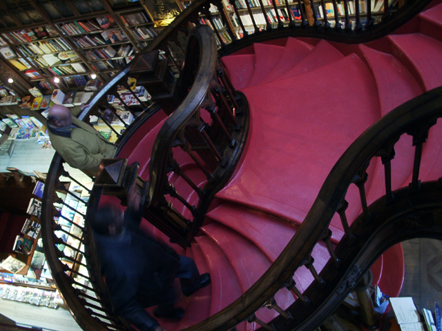
The steps are red, but they're almost overpowered by the really busy jumbled background. They're a fun shape, but they just don't stand out enough. |
|
|
|
03/11/2002 05:48:00 PM |
|
I think this picture would have been better if you would have framed it more to the right to get more of the steps in the photo. The downstairs of the library on the left is distracting |
|
|
|
03/11/2002 05:29:00 PM |
|
I really like this one... I understand it's not technically that great a picture, but the subject is great and I like the angle. |
|
|
|
03/17/2002 11:31:00 PM |
|
I really like this. The shape of the stairs is really pleasing in the way they seem to flow around. |
|
|
|
03/17/2002 01:00:00 AM |
|
I love the sense of chaos I get from the picture. |
|
|
|
03/16/2002 03:08:00 PM |
|
I like it; however I think it lost some of its impact (the contrast betweent the red and the banister) with the people in it |
|
|
|
03/15/2002 10:09:00 PM |
|
|
|
03/14/2002 02:13:00 PM |
|
I love the stairs and the angle. Great shot. |
|
|
|
03/13/2002 03:21:00 PM |
|
Awesome picture-very creative idea! |
|
|
|
03/12/2002 06:06:00 PM |
|
nice use of red. And nice angle! |
|
|
|
03/12/2002 12:53:00 PM |
|
very good architecture, and good position to make photo. |
|
|
|
03/12/2002 09:24:00 AM |
|
nice idea... perhaps use a more shallow DOF to throw the distracting background (books) out of focus? |
|
|
|
03/11/2002 08:17:00 PM |
|
Nicely done, I like the flowing lines. It may not have been possible but I would have liked to have seen a different compostion where the lines wrapped themselves into the picture or flow more gracefully in and out of the picture. It looks to me like the bottom cuts off the flow of the bannister and the top almost comes back to make a nice spiral but the bit that goes off by itself breaks the flow and makes the picture incomplete by dragging your eye/attention out of the frame again. |
|
|
|
03/11/2002 01:25:00 PM |
|
Neat perspective. Great subject matter. Would be "10" with better lighting and color saturation. |
|
|
|
03/11/2002 03:54:00 AM |
|
When a picture makes you tilt your head and after you do this you feel dizzy thats when you know its a masterpeice beyond words |
|
|
|
03/11/2002 02:50:00 AM |
|
extremely interesting angle |
|
|
|
03/11/2002 01:54:00 AM |
|
hey, old man, get out of my shot!.. stairs are nice subject tho |
|
|
|
03/11/2002 07:21:00 PM |
|
The steps are red, but they're almost overpowered by the really busy jumbled background. They're a fun shape, but they just don't stand out enough. |
|
|
|
03/11/2002 05:48:00 PM |
|
I think this picture would have been better if you would have framed it more to the right to get more of the steps in the photo. The downstairs of the library on the left is distracting |
|
|
|
03/11/2002 05:29:00 PM |
|
I really like this one... I understand it's not technically that great a picture, but the subject is great and I like the angle. |
|
Home -
Challenges -
Community -
League -
Photos -
Cameras -
Lenses -
Learn -
Help -
Terms of Use -
Privacy -
Top ^
DPChallenge, and website content and design, Copyright © 2001-2026 Challenging Technologies, LLC.
All digital photo copyrights belong to the photographers and may not be used without permission.
Current Server Time: 06/28/2026 07:54:33 PM EDT.