| Author | Thread |
Comments Made During the Challenge  |
|
|
06/17/2003 10:04:09 AM |
|
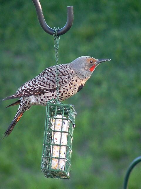
Wonderful image - well lit and I like the catchlight (is that the word I'm looking for?) in the eye. Doesn't quite feel like a balanced composition. Metal object in bottom right foreground distracts from clean "background". 8 |
|
|
|
06/17/2003 07:29:36 AM |
|
|
|
06/16/2003 12:44:48 AM |
|
The hook at the top is a little distracting. Nice shot with good colors and focus. I like your DOF. |
|
|
|
06/15/2003 12:06:57 PM |
|
Would crop top hook & lower right thing. |
|
|
|
06/14/2003 07:53:04 AM |
|
Great image, suits the theme of this week's challenge very well. 8 Morgan |
|
|
|
06/13/2003 09:16:12 PM |
|
Nice shot. He was lookin' right at you. Works for me as a Mag cover plenty of room for title and contents. |
|
|
|
06/13/2003 04:07:09 PM |
|
Very nice photo of the Flicker! Very good color and the focus is strong. Too bad the chain is in front, but you couldn\'t very well control that. Reminds me of one of my photos (only yours is frankly MUCH better!). 10 Rob the Swash |
|
|
|
06/12/2003 04:51:05 PM |
|
Nice capture. The bird is a beauty! |
|
|
|
06/12/2003 04:18:42 PM |
|
Great shot, the blurred backgound makes your subject nice and focused. |
|
|
|
06/12/2003 12:51:37 AM |
|
works for me. the bird is really in focus and excellent color. excellent specimine too. 9 |
|
|
|
06/11/2003 10:14:58 PM |
|
Nice shot. A little too much "blank" space at the right side, but what a lovely catch on the bird! |
|
|
|
06/11/2003 05:04:05 PM |
|
nice photo, should have cropped whatever that is in the bottom right corner. |
|
|
|
06/11/2003 01:13:20 PM |
|
As a magazine cover, this fits the bill. You leave space for the title and article information but your focal point is bright and clear and lets the viewrer know the content of the magazine right off the bat. |
|
|
|
06/11/2003 01:04:41 PM |
|
This could use a little bit more space on the left and recomposed without the bar in the lower right corner. still a good shot. |
|
|
|
06/11/2003 12:10:11 PM |
|
eey. nice pic =) it would be better with more definition / detail in its body.. |
|
|
|
06/11/2003 10:21:36 AM |
|
I like your woodpecker but think the focus is a bit too soft. The colors are good. |
|
Home -
Challenges -
Community -
League -
Photos -
Cameras -
Lenses -
Learn -
Help -
Terms of Use -
Privacy -
Top ^
DPChallenge, and website content and design, Copyright © 2001-2026 Challenging Technologies, LLC.
All digital photo copyrights belong to the photographers and may not be used without permission.
Current Server Time: 06/28/2026 08:06:58 PM EDT.